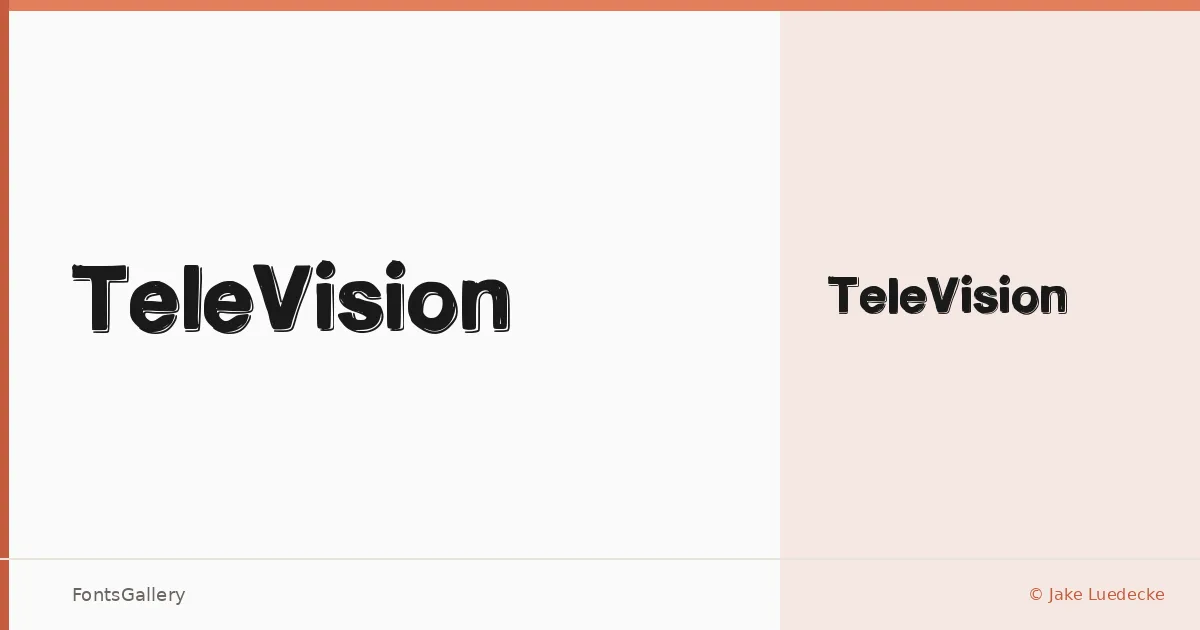
About TeleVision Font
There is a deliberate tension in this sans — the weight of a Medium cut held to a single, focused expression. Designed by Jake Luedecke, TeleVision arrives as one style: Medium, delivered as a TTF. The geometry is clean and self-assured, the kind of letterform that does not need variation to make its presence felt.
Design Aesthetics & Character Characteristics
Sitting squarely in the sans serif category, it reads as minimal and modern with enough professional weight to anchor a composition. The single Medium style is neither light nor heavy — it occupies a confident middle register that holds at large sizes without collapsing into noise. The forms lean bold in spirit while keeping their lines uncluttered, which gives them a broadcast-ready clarity.
Recommended Usage & Font Pairing
This is a face built for headline work: branding identities, logo lockups, signage, and website headers where a clean, decisive stroke is more useful than decorative nuance. When contrast is needed, it pairs well with Canela, Armelie, 321 Impact, AQUA, and Kactigona — each offering a different register of texture or weight to play against its neutrality.
License & Usage Terms
TeleVision is offered under Personal Use terms, which means commercial use is not permitted — confirm licensing with the designer before committing it to a client job. The font carries installable embedding permission.