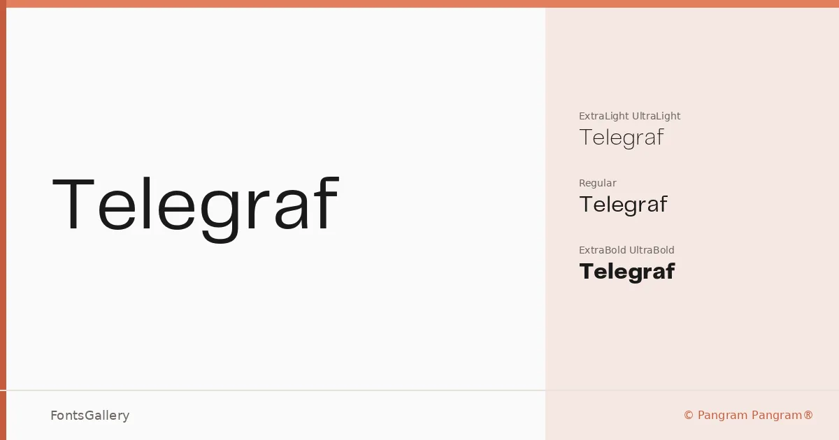
About Telegraf Font
There is a particular confidence in the geometry here — clean terminals, controlled spacing, and a proportional calm that holds at any size. Nick Losacco drew this family for Pangram Pangram®, and the result is a geometric sans with just enough personality to read as considered rather than cold. The letterforms stay disciplined across every weight without losing their quiet authority.
Design Aesthetics & Character Characteristics
The family spans three cuts — UltraLight, Regular, and UltraBold — which is a deliberately tight palette, and the contrast between the extremes is the whole point. Set the UltraBold in a headline and the UltraLight in a subhead and the hierarchy snaps into place with almost no additional work. The overall mood sits squarely in minimal and modern territory, professional without being anonymous, and the OTF files carry that consistency across environments.
Recommended Usage & Font Pairing
This family earns its place in branding systems, magazine layouts, website headers, and logo work — anywhere Latin-script copy needs to project clarity and weight without decoration. It pairs well with the contrast of a high-contrast serif like Canela or Anglecia Pro, softens nicely against a script such as Allura or Ballmain, and can hold its own alongside the blunt force of 321 Impact when the brief calls for layered typographic energy.
License & Usage Terms
Telegraf is available under a Personal Use license, which means it is not cleared for commercial work — confirm licensing terms with Pangram Pangram® before deploying it on a client project. Embedding is permitted for preview and print only.