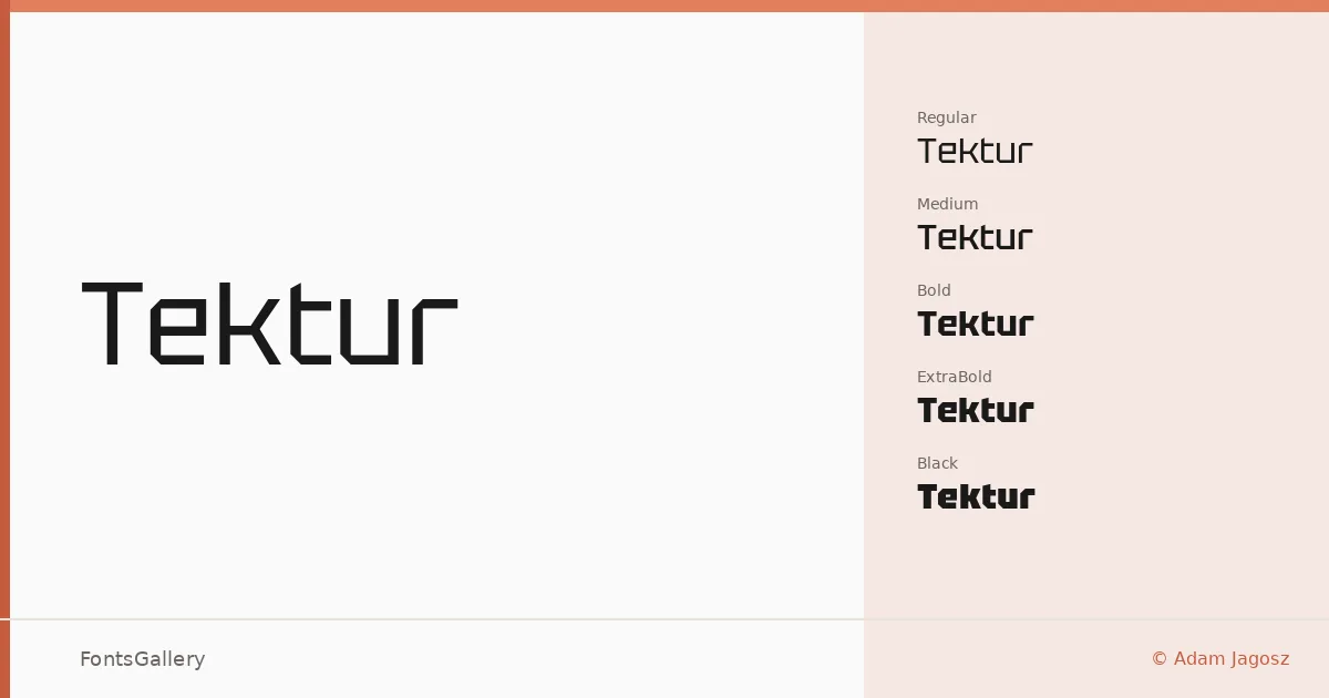
About Tektur Font
There is something immediately architectural about this face — the curves have been cut away, replaced by octagonal outlines and rectangular counters that give every letter a constructed, almost machined quality. It was designed by Adam Jagosz, whose approach here is disciplined: apply the geometric substitution where rounds would normally appear, but leave the diagonals alone. That restraint keeps the letterforms readable rather than novelty-driven, and a high x-height combined with ascenders that sit flush with the cap height makes for unusually compact text blocks.
Design Aesthetics & Character Characteristics
Tektur sits in the sans-serif category but leans hard into a futuristic and minimal sensibility — the kind of geometry that reads as modern without feeling borrowed from mid-century experiments. The family runs from Regular through Medium, SemiBold, Bold, ExtraBold, and Black, giving you a weight range substantial enough to build a hierarchy from a single source. All cuts ship as TTFs with installable embedding permissions. At lighter weights the structure feels precise and cool; at Black it becomes genuinely commanding.
Recommended Usage & Font Pairing
The design earns its place in branding, logo work, poster headlines, and signage — anywhere the geometry can be seen at size and the octagonal detail registers as intentional craft rather than quirk. Latin, Latin Extended (partial), Vietnamese, Cyrillic, and Greek are all covered, which broadens its reach for multilingual campaigns. For contrast, the listed pairings span a wide tonal range: the editorial warmth of Canela or Times New Roman, the calligraphic softness of Angeletta or Magnolia Script, and the pixelated bluntness of Minecraft each offer a different kind of counterpoint to the face's angular precision.
License & Usage Terms
Tektur is released under the SIL Open Font License, Version 1.1, which permits commercial use freely — full details and the accompanying FAQ are at https://scripts.sil.org/OFL.