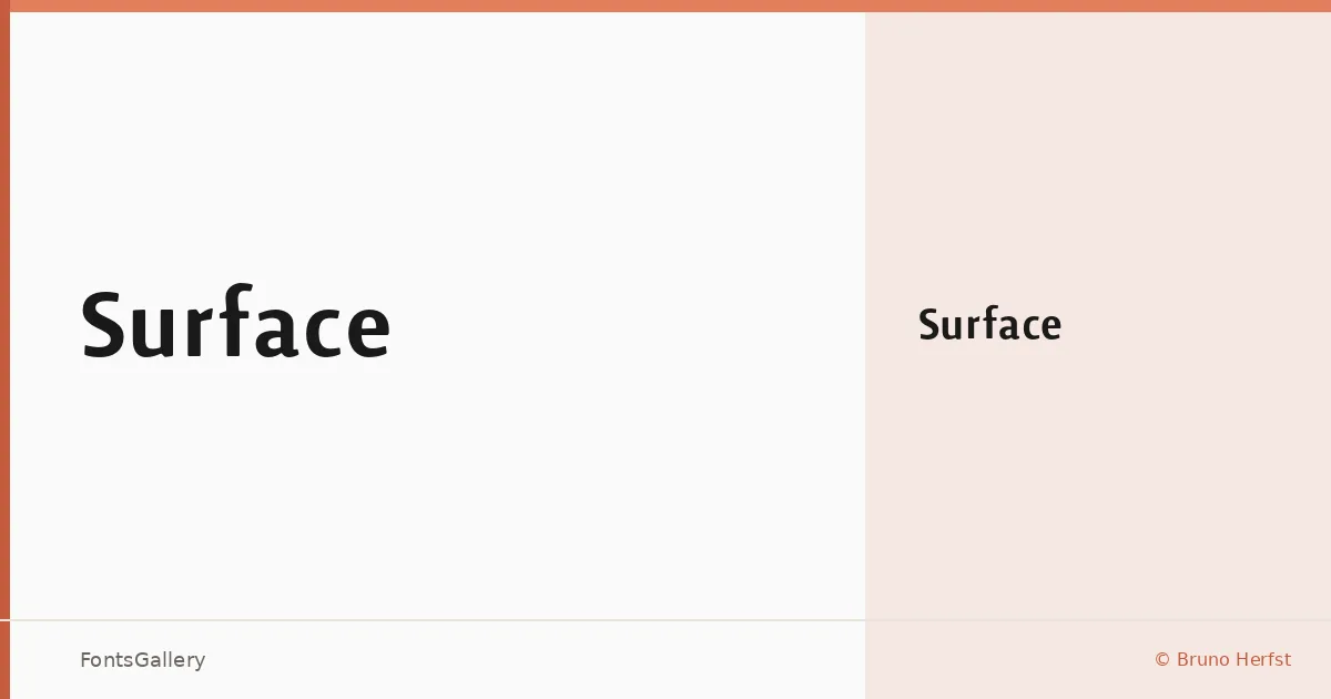
About Surface Font
There is a particular kind of restraint in Bruno Herfst's single-weight sans that rewards a second look. Released under his own name, this Latin-covering face arrives as a single Medium cut in OTF format — no sprawling weight range, just one carefully considered middle ground between light and bold.
Design Aesthetics & Character Characteristics
The forms sit squarely in the modern sans serif tradition, carrying an elegant and minimal sensibility that keeps every letterform clean without feeling cold. That professional composure makes the Medium weight surprisingly flexible across contexts: it holds authority at display sizes without losing composure when set smaller. The spacing feels deliberate, the kind of rhythm that suits refined editorial and identity work rather than heavy text setting.
Recommended Usage & Font Pairing
It earns its keep in branding environments — logo lockups, business cards, and magazine headlines where a controlled, unhurried sans is exactly right. Website headers also benefit from that same tonal steadiness. For pairings, the face sits well alongside Canela or Rasley Heights when you want a contrasting serif warmth, and it holds its own next to Times New Roman for a more classical pairing. Angeletta adds a calligraphic counterpoint, while Dharma Gothic E introduces weight contrast for poster-scale work.
License & Usage Terms
Surface is available for commercial use, and the font is licensed with installable embedding permissions — clear terms for professional deployment.