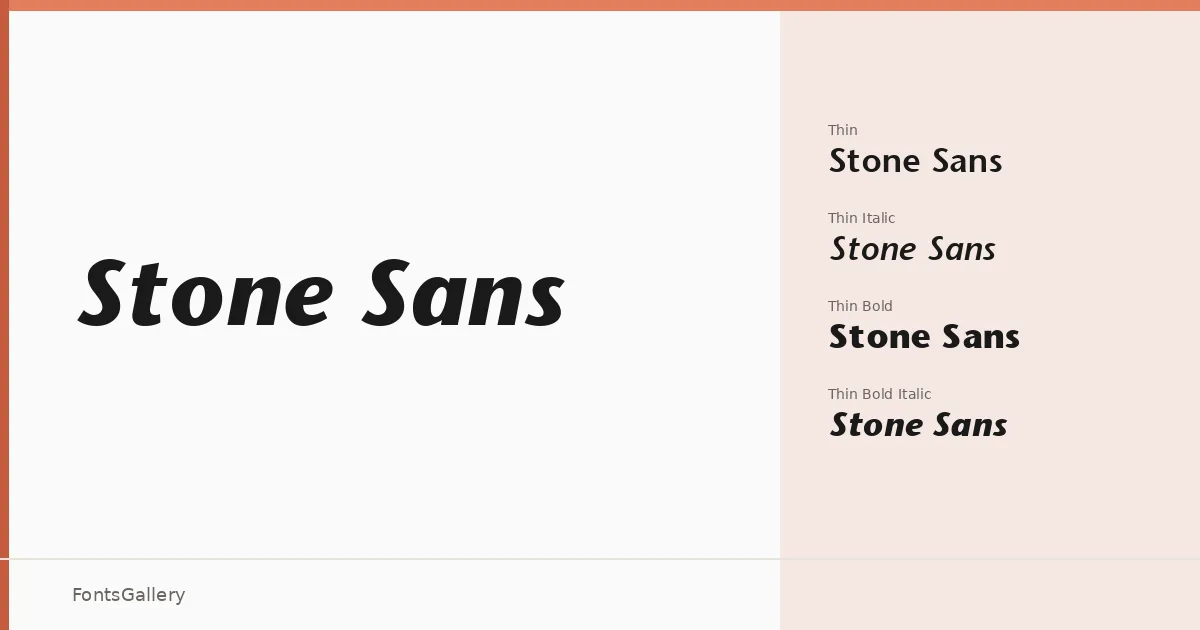
About Stone Sans Font
There is a particular steadiness to this family — the kind of measured, unhurried geometry that characterizes well-considered humanist sans-serifs. Dating back to 1992, when it was published by Image Club Graphics, the design carries the confidence of that period's serious editorial work without feeling dated. The letterforms hold a clean optical balance across weights, with terminals and apertures that stay open and legible at both display and text sizes.
Design Aesthetics & Character Characteristics
This is a sans-serif with a professional, minimal character — modern in its proportions but classic in its composure. The family spans a generous range, from Thin and Thin Italic through Regular, Semi Bold, Bold, and Bold Italic, along with their italic counterparts, giving you a coherent system of contrasting weights rather than a handful of isolated cuts. In use, the lighter weights read with quiet refinement while the Bold and Bold Italic carry enough authority for headlines and callouts without resorting to aggression. Files are delivered in TTF format.
Recommended Usage & Font Pairing
The range of weights makes this well-suited to branding systems, business cards, magazine layouts, and presentation decks where a clean Latin-script sans-serif needs to carry visual hierarchy on its own. Website headers benefit from the bolder weights, while the Thin and Regular cuts work naturally in supporting roles. It pairs with Canela, Allura, 321 Impact, ABC Arizona, and Ballmain — each combination shifting the overall tone from editorial warmth to expressive contrast depending on which companion you reach for.
License & Usage Terms
No license name or commercial-use status was provided with this family, so confirm the terms directly with the rights holder before any commercial deployment. Embedding is permitted at the installable level, and copyright is held by Image Club Graphics, Inc.