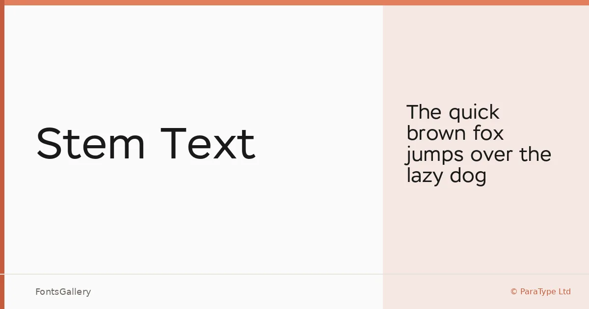
About Stem Text Font
Geometric sans-serifs often sacrifice readability at smaller sizes in pursuit of formal purity — this one does not. Designed by Alexandra Korolkova with assistance from Marya Selezeneva and Isabella Chaeva, and released by ParaType Ltd, Stem Text is built around a large x-height and a semi-closed aperture that keeps letterforms distinct and open even when set tight in a column of body copy.
Design Aesthetics & Character Characteristics
The single style available — Regular — carries a modern, minimal character that sits comfortably on the classic end of the geometric sans tradition. That restraint reads as professional rather than cold, which is what makes it work across both editorial and corporate contexts. It is fully compatible with the Stem display family, so the two can be used together seamlessly: Stem handles headlines, Stem Text handles the running text beneath. Coverage extends across Latin and Cyrillic scripts.
Recommended Usage & Font Pairing
The combination of text-size legibility and headline-ready composure makes it a natural fit for magazine layouts, book covers, branding systems, presentations, and website headers — anywhere a clean, disciplined sans needs to hold up at multiple scales. For pairing, the family sits well alongside contrasting faces such as Canela, ABC Arizona, Armelie, Kactigona, and 321 Impact, each offering a different degree of personality against its neutrality.
License & Usage Terms
Stem Text is offered under Personal Use terms — commercial use is not permitted, so confirm licensing at paratype.com/eula before committing it to a client job. Embedding is limited to preview and print only.