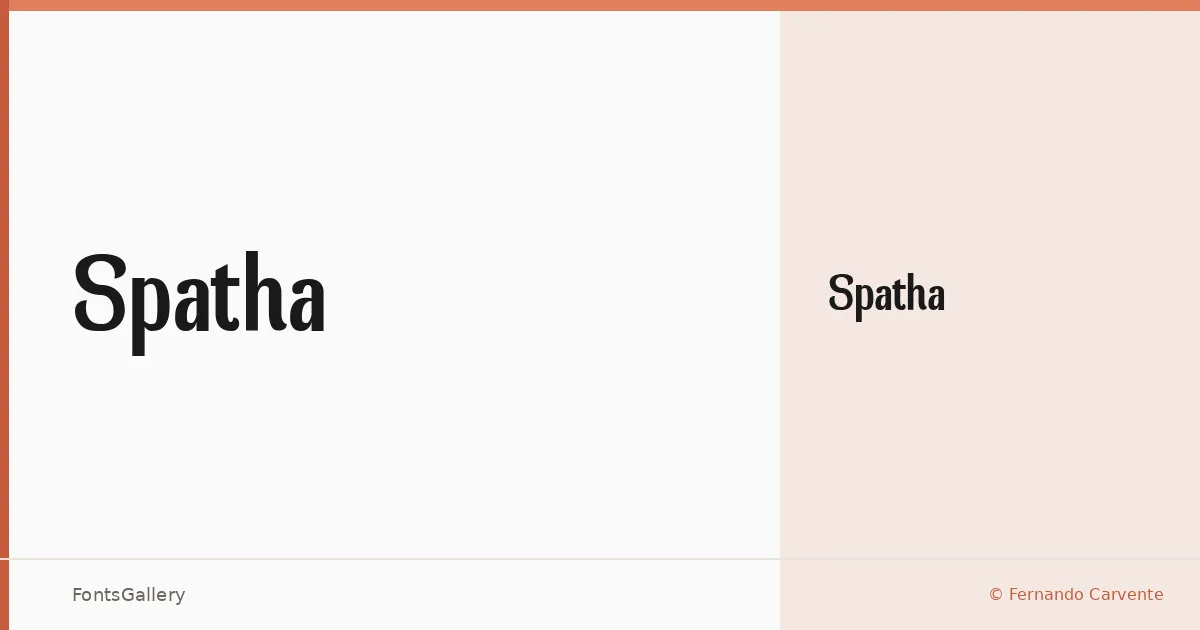
About Spatha Font
There is a quiet confidence to this sans — nothing decorative, nothing wasted. Fernando Carvente drew a single Regular cut that holds its ground through sheer economy of form, keeping Latin coverage clean and uncluttered.
Design Aesthetics & Character Characteristics
The design sits firmly in the modern, minimal end of the sans-serif spectrum: strokes that are consistent in weight, proportions that read as bold without leaning into display extremes, and an overall professional restraint. Available as a single Regular style in TTF format, it is a face that earns attention through structure rather than flourish — the kind of letterform that holds up at headline scale and anchors a logo mark with equal ease.
Recommended Usage & Font Pairing
Its strengths come through most clearly in branding contexts, poster headlines, magazine folios, and logo lockups where a clean, modern voice is needed. It pairs well alongside contrasting faces — the editorial warmth of Canela or Times New Roman, the script energy of Angeletta or Armelie, and even the blocky character of Minecraft all offer productive tension against its cool geometry.
License & Usage Terms
Spatha is released under Personal Use terms, which means commercial use is not permitted — confirm licensing with the designer before committing it to any client or revenue-generating work. Embedding is limited to preview and print only.