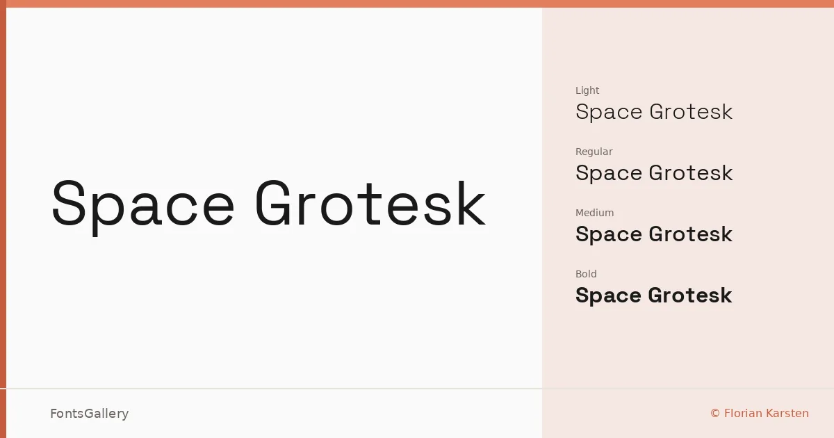
About Space Grotesk Font
There is a particular tension in this sans-serif that makes it hard to ignore: the proportions are clean and rational, yet individual letterforms carry just enough quirk — a clipped terminal here, an unusual junction there — to keep things from feeling anonymous. Florian Karsten drew it with that friction deliberately in place, and the result is a geometric grotesque that has genuine personality without sacrificing the calm authority you need for professional work.
Design Aesthetics & Character Characteristics
The family runs from Light through Bold, with a variable font spanning that range continuously, and all cuts are available in TTF, OTF, and WOFF2. The overall mood lands somewhere between minimal and assertive — sturdy enough to anchor a brand, restrained enough to carry body copy in a magazine spread or a presentation deck. Latin and Latin Extended characters are covered, and Vietnamese is included as well, which broadens its usefulness for multilingual editorial and web work.
Recommended Usage & Font Pairing
It earns its keep in branding systems, website headers, logo lockups, and anywhere a modern, professional presence matters without resorting to decorative noise. The variable format is a practical advantage for responsive web environments where you want precise weight control across breakpoints. For contrast pairings, it sits well alongside the editorial warmth of Canela, the handwritten grace of Armelie, or the display energy of Urban Thunder Demo, AQUA, and Kactigona.
License & Usage Terms
Space Grotesk is released under the SIL Open Font License (OFL), Version 1.1, which permits commercial use — including embedding with installable permissions — and full details are available at https://scripts.sil.org/OFL.