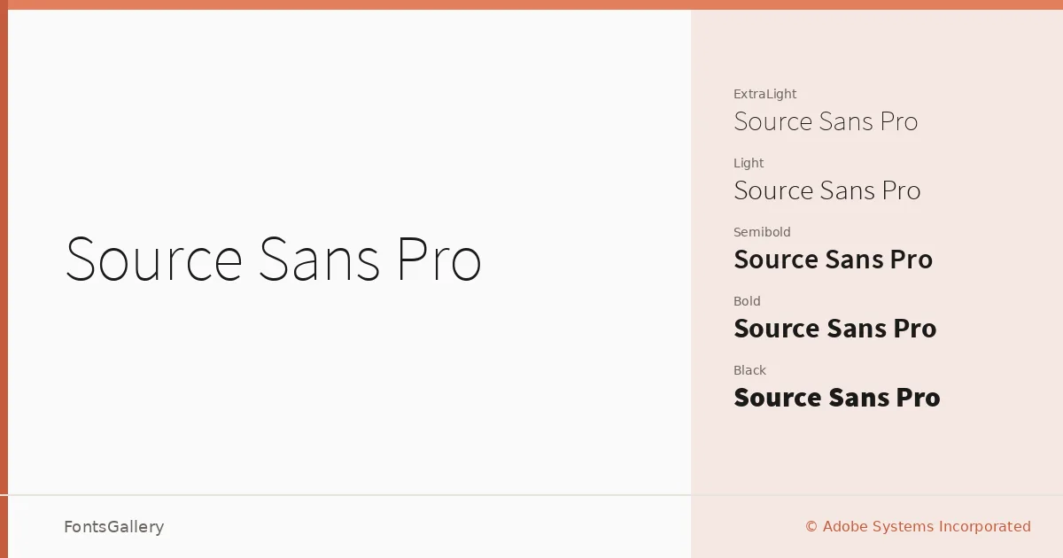
About Source Sans Pro Font
There is a particular kind of quiet confidence in a well-made humanist sans — the way it holds its weight across a long column of text without ever drawing attention to itself. This family was designed by Paul D. Hunt for Adobe Systems Incorporated, and it shows that pedigree in the details: the slightly open apertures, the carefully managed stroke contrast, and the generous x-height that keeps it readable at small sizes without sacrificing elegance at display scale.
Design Aesthetics & Character Characteristics
The family spans twelve styles — ExtraLight through Black, each with a companion Italic — giving you a genuinely complete working range rather than a token handful of weights. The tone sits squarely in the classic and professional register: minimal enough to disappear when the content demands it, modern enough to feel current in any clean layout. The italics are true obliques with enough personality to signal emphasis without disrupting the overall even color of a page.
Recommended Usage & Font Pairing
The lighter weights handle magazine body copy and business card text with equal composure, while the Semibold and Black cuts earn their place in website headers, presentation titles, and branding work where hierarchy matters. Latin and Vietnamese character sets are both covered, which makes it a reliable choice for multilingual business and editorial contexts. It pairs well with the serifs Anglecia Pro and Ballmain when you want a classic text-and-display contrast, and holds its own alongside the more expressive display faces 321 Impact, AQUA, and Batoshi when the job calls for something with more energy.
License & Usage Terms
Released under the SIL Open Font License, Version 1.1, which permits commercial use and installable embedding — you can bundle, embed, and redistribute it freely, though the fonts themselves may not be sold as standalone files, and any modified versions must retain the same license and may not use the Reserved Font Name "Source."