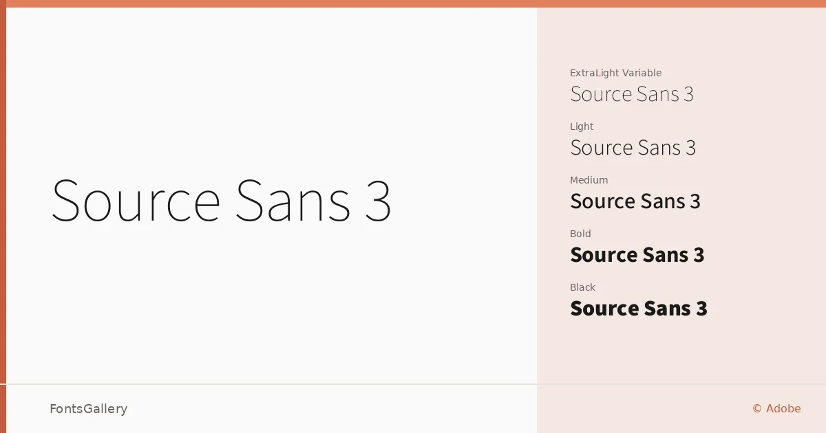
About Source Sans 3 Font
There is a particular clarity to this family that makes itself known immediately — clean strokes, open apertures, and a rhythm that never feels strained. Designed by Paul D. Hunt for Adobe, it represents a careful approach to humanist sans-serif construction: the letterforms are neutral enough to disappear into a layout when needed, yet carry enough personality to hold their own at display sizes. The full weight range runs from ExtraLight through Black, each with a matching italic, and the family also ships as variable fonts covering both upright and italic axes.
Design Aesthetics & Character Characteristics
The overall tone sits comfortably across classic, minimal, and modern sensibilities — it reads as professional without ever feeling stiff. The upright cuts, from ExtraLight Variable and ExtraLight through Black, maintain consistent spacing and even color across weights, while the italic variants follow the roman structure closely rather than introducing dramatic calligraphic contrast. Available in TTF format, the family covers Latin, Latin Extended (partial), Vietnamese, Cyrillic, and Greek, which makes it a practical choice wherever copy spans more than one script region.
Recommended Usage & Font Pairing
The measured geometry here suits branding systems, business cards, presentation decks, magazine layouts, and website headers — anywhere legibility under pressure matters. The lighter weights work especially well in editorial body text, while SemiBold and Bold carry headlines without shouting. For pairing, the family has been tested alongside Anglecia Pro, Ballmain, 321 Impact, AQUA, and Batoshi, each offering enough contrast in structure or texture to create a clear typographic hierarchy.
License & Usage Terms
Released under the SIL Open Font License, Version 1.1, which explicitly permits commercial use — full terms and the accompanying FAQ are available at http://scripts.sil.org/OFL. Embedding is set to installable, so documents can be freely distributed with the fonts embedded.