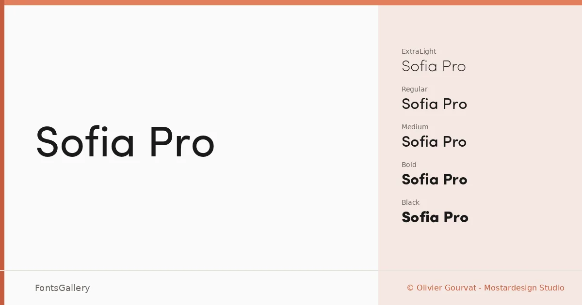
About Sofia Pro Font
There is a quietness to this sans-serif that earns its keep — clean stroke contrast, well-judged apertures, and a geometric backbone that never tips into coldness. It comes from Olivier Gourvat at Mostardesign Studio, and the care in the spacing shows across every weight. The letterforms sit with enough personality to feel designed rather than assembled, yet enough restraint to disappear into a layout when that is what the work demands.
Design Aesthetics & Character Characteristics
The family runs from UltraLight and ExtraLight through Light, Regular, Medium, SemiBold, Bold, and all the way to Black, with companion italics at every step — sixteen cuts in total, all delivered as OTF files. That range gives a minimal, professional system that can shift from editorial delicacy at the thin end to commanding weight at the Black. The mood sits comfortably in elegant and modern territory without chasing trends, which keeps it useful across a long project life.
Recommended Usage & Font Pairing
The Latin coverage and the overall register make it a natural choice for branding programs, logo lockups, business cards, magazine layouts, and website headers — anywhere that professional composure matters. It pairs well with the contrasting energy of AQUA, the display character of Ballmain, the impact of 321 Impact, and the structural qualities of Aranea and Batoshi, depending on how much tension or harmony a particular piece needs.
License & Usage Terms
Sofia Pro is available for commercial use under its included license, with installable embedding permissions. The rights are fully reserved by Mostardesign Studio, and any reproduction, modification, or transfer requires express written approval — contact Mostardesign directly at mostardesign.com to confirm the terms that apply to your intended use.