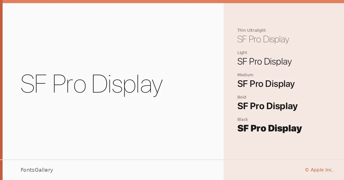
About SF Pro Display Font
There is a particular kind of quiet confidence in how these letterforms sit on the page — clean, open, and unhurried. Designed by Apple Inc., this is the display-weight branch of their San Francisco system typeface, built to carry the visual language of Apple's platforms at larger sizes. The geometry is restrained: consistent stroke modulation, generous spacing, and terminals that never draw attention to themselves.
Design Aesthetics & Character Characteristics
This is a modern sans-serif that leans minimal and professional without feeling cold. The family spans an unusually broad weight range — Ultralight and Thin at the feathery end, through Light, Regular, Medium, and Semibold in the middle registers, up to Bold, Heavy, and Black for when real mass is needed — and every weight ships with a matching italic. All cuts are available as OTF files. Across that full span, the proportions hold steady, which makes mixing weights within a layout feel natural rather than forced.
Recommended Usage & Font Pairing
The family earns its name at display scale: website headers, magazine spreads, presentation decks, and brand identities where a modern, professional register is expected. Language coverage extends across Latin and Latin Extended (partial), Vietnamese, Cyrillic, and Greek, which broadens its reach considerably for multilingual editorial and branding work. For pairing, the contrast-rich serif Canela makes a compelling companion, as does the expressive script Armelie; ABC Arizona, 321 Impact, and Kactigona are also listed as complementary choices depending on how much tension or weight contrast the layout calls for.
License & Usage Terms
SF Pro Display is available under Personal Use terms only — commercial use is not permitted, and the embedding permission is limited to preview and print; confirm your rights under the applicable iOS Software License Agreement before deploying this typeface in any commercial context. San Francisco is a trademark of Apple Inc., © 2015–2017.