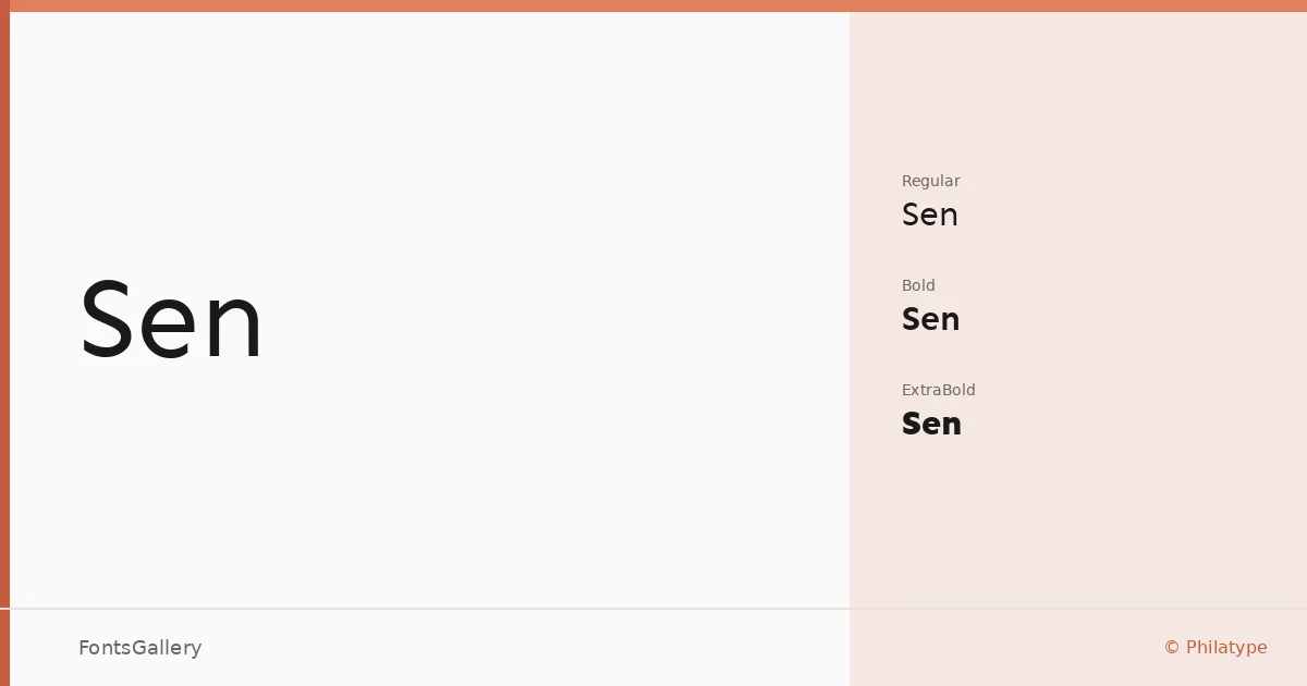
About Sen Font
There is a quiet confidence to this sans serif — a clean geometric structure that holds its ground without demanding attention. Designed by Kosal Sen of Philatype, the family keeps its letterforms open and unhurried, with proportions that read clearly at both large display sizes and tighter editorial settings.
Design Aesthetics & Character Characteristics
The family sits firmly in the modern, minimal end of the sans serif spectrum — professional without being cold. Three weights are available: Regular, Bold, and ExtraBold, each stepping up in mass without losing the restrained character of the design. Files are distributed in TTF, OTF, SVG, WOFF, and EOT formats, so deployment across print workflows and web environments is straightforward. The ExtraBold in particular has the kind of density that makes it useful for headline work where you need presence without ornament.
Recommended Usage & Font Pairing
The weight range lends itself naturally to branding systems, magazine hierarchies, website headers, and presentation decks — anywhere a clean Latin-script sans needs to carry structure on its own. For contrast pairings, it works well alongside Canela or ABC Arizona, both of which bring a warmer serif texture to balance the geometry here. Angeletta and Armelie offer a more decorative counterpoint for editorial or lifestyle contexts, while Minecraft provides a distinctly informal contrast when the job calls for it.
License & Usage Terms
Released under the SIL Open Font License (OFL), which allows commercial use. Embedding is set to editable, so documents using these fonts can be shared and modified without restriction.