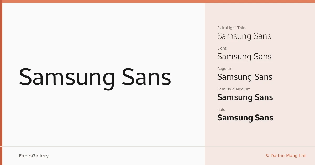
About Samsung Sans Font
There is a controlled tension in these letterforms — the kind that comes from designing for screens at every scale, from a watch face to a billboard. Drawn by Dalton Maag Ltd for Samsung Electronics, the family carries the quiet confidence of a corporate sans that has been genuinely thought through rather than assembled from conventions. The strokes are clean without being cold, and the proportions hold their own whether set large or small.
Design Aesthetics & Character Characteristics
This is a modern, minimal sans serif with a professional bearing — the sort of face that reads as organized before you have parsed a single word. The family spans five weights — Thin, Light, Regular, Medium, and Bold — giving a useful range from editorial delicacy to assertive display. Delivered as TTF files, it covers Latin, Latin Extended (partial), Vietnamese, Cyrillic, Greek, and Hangul, which makes it a serious choice for multilingual work. At the lighter end the letters feel almost geometric; the Bold arrives with enough authority for headlines without tipping into aggression.
Recommended Usage & Font Pairing
The weight range and measured tone make it well suited to branding systems, presentation decks, signage, and website headers where consistency across many sizes matters. The Cyrillic, Greek, Hangul, and Vietnamese coverage means you can carry a single typographic voice across campaigns that span several writing systems. For contrast, the named pairings suggest reaching toward something with more personality at the serif end — Canela or ABC Arizona would introduce warmth — or toward something expressive like Armelie or Kactigona; 321 Impact brings a harder edge if you need weight-against-weight tension.
License & Usage Terms
Samsung Sans is available under Personal Use terms — commercial use is not permitted, so confirm your rights carefully before applying it to client work or commercial projects. Embedding permissions are set to editable.