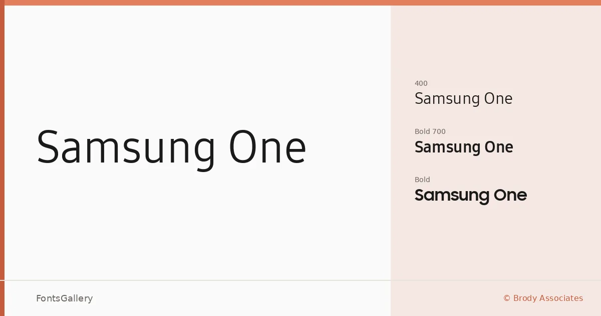
About Samsung One Font
There is a particular restraint to this sans serif — clean stroke terminals, even spacing, and a geometric discipline that reads as deliberate rather than cold. It was designed by Neville Brody, Luke Prowse, and Florian Runge at Brody Associates for Samsung Electronics, and every decision in the letterforms reflects the kind of considered minimalism that a global technology brand demands at scale.
Design Aesthetics & Character Characteristics
The family carries a bold, modern, and professional character across three styles: two weights in the core range — Regular 400 and Bold 700 — joined by Samsung Sharp Sans Bold, which brings a sharper geometric edge to the mix. The forms sit comfortably in the minimal end of the spectrum without sacrificing legibility at either large or small sizes. Files are delivered as TTF, and the script coverage is notably broad: Latin, Latin Extended, Vietnamese, Cyrillic, Greek, and partial Coptic.
Recommended Usage & Font Pairing
The design was built for exactly the contexts where consistency under pressure matters most — branding systems, signage, website headers, advertising, and presentations where the type needs to hold authority without crowding the composition. For pairing, the contrast-rich curves of Canela make a strong editorial counterpoint, while Armelie, 321 Impact, ABC Arizona, and Kactigona each offer different directions depending on whether the project calls for softness, impact, or something more expressive alongside this structured sans.
License & Usage Terms
This family is available under personal-use terms only — all rights are reserved by Samsung Electronics Co., Ltd., and unauthorized use or distribution is expressly prohibited, so confirm clearance before committing it to any commercial job. Embedding is permitted at editable level.