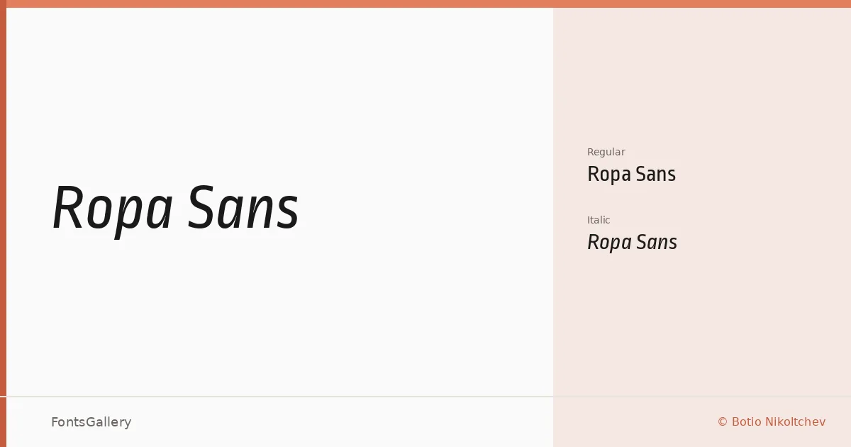
About Ropa Sans Font
There is a studied quietness to these letterforms — clean strokes, restrained proportions, and just enough personality to keep things from feeling cold. Botio Nikoltchev designed this family, and the work reflects a deliberate editorial sensibility: nothing is decorated that doesn't need to be, yet the characters never feel mechanical.
Design Aesthetics & Character Characteristics
The family sits in minimal, modern, professional territory, arriving in two cuts: Regular and Italic. Both share the same low-friction geometry that makes a sans-serif readable at headline scale without losing its composure at smaller sizes. The Italic is a genuine companion rather than a slant — it carries its own rhythm without diverging too far from the upright's measured tone. Files ship as TTF, with installable embedding permissions.
Recommended Usage & Font Pairing
The shapes are well-suited to branding, logo work, magazine layouts, presentation decks, and website headers — essentially any context where Latin-script text needs to hold authority without shouting. For pairing, the family works alongside Anglecia Pro, Ballmain, 321 Impact, AQUA, and Batoshi, each offering a different degree of contrast against the sans's neutrality.
License & Usage Terms
Ropa Sans is available for commercial use under the SIL Open Font License, Version 1.1. Full terms and a FAQ are at http://scripts.sil.org/OFL.