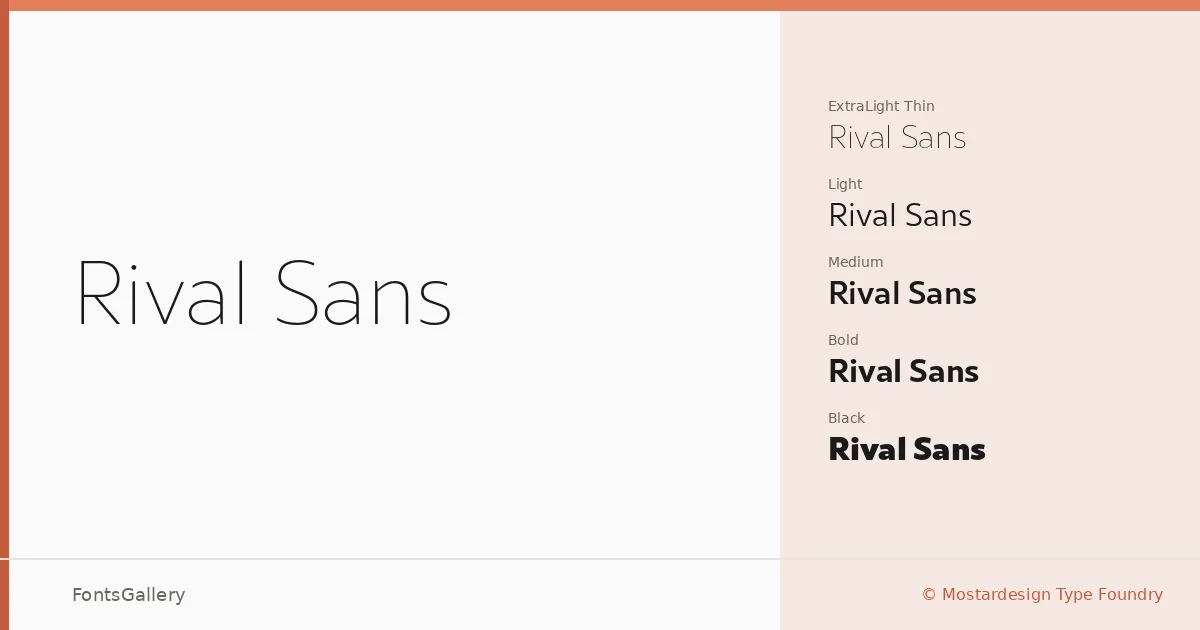
About Rival Sans Font
There is a controlled tension running through these letterforms — a geometric precision that never tips into coldness. Olivier Gourvat at Mostardesign Type Foundry built a sans that holds its composure across an unusually wide weight spectrum, and that discipline is visible in every cut from Thin through Black.
Design Aesthetics & Character Characteristics
The family spans twenty styles: Thin, ExtraLight, Light, Regular, Medium, ExtraBold, and Black, each paired with a matching italic, plus Narrow Bold and Narrow Black with their italics — all delivered as OTF files. That range gives the system a minimal, professional quality in the lighter weights and a genuinely commanding presence in the heavier ones. The Narrow cuts add a condensed option that tightens up without losing the characteristic stroke consistency the uprights carry throughout.
Recommended Usage & Font Pairing
The design earns its keep in branding, magazine layouts, advertisement campaigns, and website headers — anywhere a modern, clean sans needs to work across multiple hierarchy levels within a single system. For type pairing, it has been matched with Anglecia Pro, Ballmain, 321 Impact, AQUA, and Batoshi, giving you a range of contrast options from classical serif to display.
License & Usage Terms
This family is distributed under a Demo license — all rights are reserved by Mostardesign Type Foundry, and commercial use is not permitted under these terms; contact Mostardesign directly at motyfo.com to confirm the appropriate license before any commercial deployment.