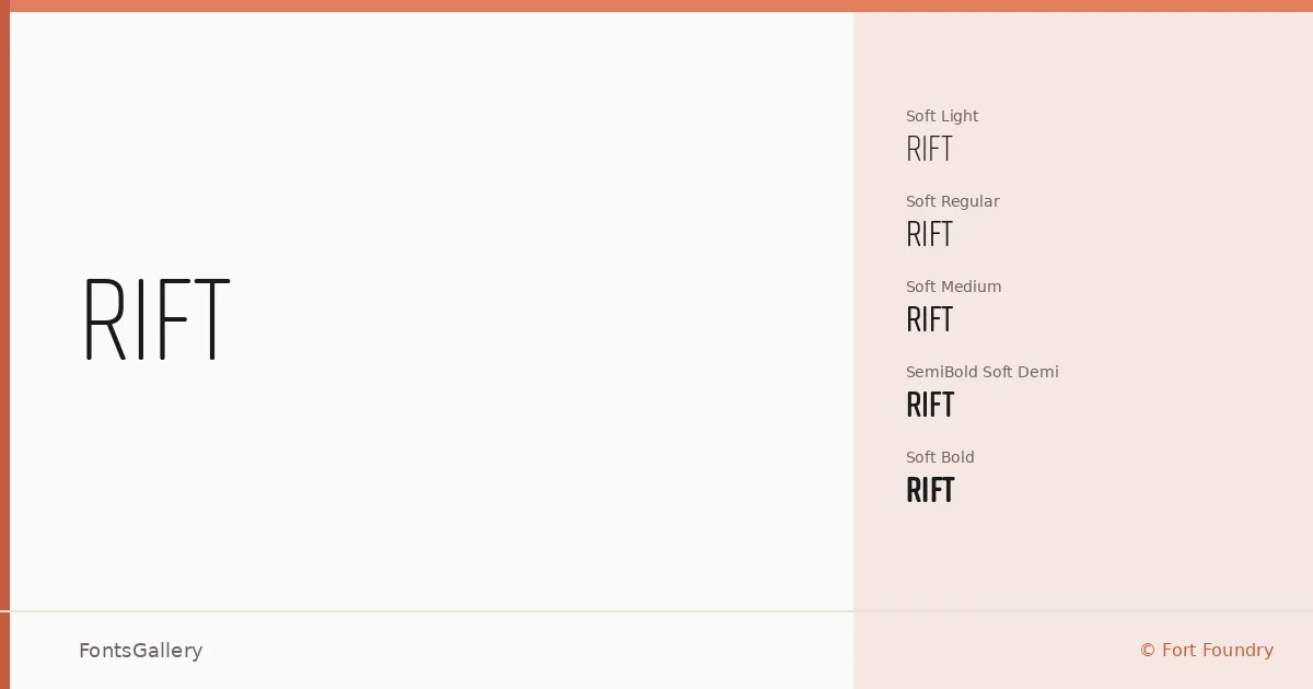
About Rift Font
There is a measured tension in these letterforms — condensed proportions held in check by clean, geometric construction. Mattox Shuler of Fort Foundry drew this sans serif in two distinct tracks: a standard cut with sharper terminals and a Soft variant that eases those corners into gentle curves without losing any of the structural confidence underneath.
Design Aesthetics & Character Characteristics
The family spans Light through Bold across both the standard and Soft tracks, with italic companions throughout and Demi weights rounding out the middle range — twenty cuts in total, all available as OTF files. The overall feeling is minimal and modern, leaning professional without becoming cold. The Soft styles in particular carry a slightly more approachable character, useful when a headline needs presence without severity. Across all weights the verticals are strong and the spacing tight enough to read as deliberate, not cramped.
Recommended Usage & Font Pairing
The compressed, bold-friendly structure makes this family well suited to poster work, magazine headlines, branding systems, and logo lockups where the type needs to hold its own at large sizes. The lighter weights open up editorial possibilities — subheadings, pull quotes, and secondary hierarchy in print layouts. For pairing, the family has been matched with Canela, Armelie, 321 Impact, ABC Arizona, and Kactigona, offering options that range from editorial serif contrast to display-weight collision.
License & Usage Terms
This family is offered under a Demo license, which does not allow commercial use — confirm licensing terms with Fort Foundry before committing it to any client or commercial project. Embedding is permitted in editable documents.