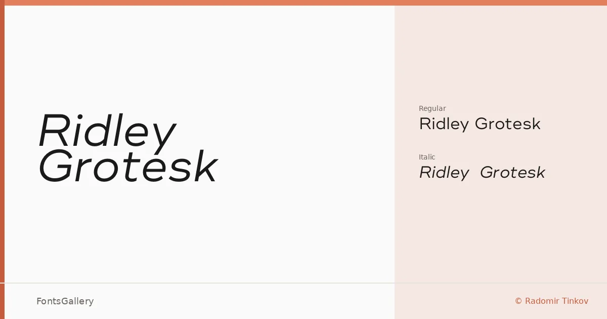
About Ridley Grotesk Font
There is a particular kind of restraint in a well-drawn grotesque — the kind where every curve feels considered rather than automatic. Radomir Tinkov brings that sensibility to this family, delivering a clean, modern sans serif with an upright roman and a companion italic, both in OTF format. The letterforms sit in that precise territory between geometric coolness and humanist approachability, with spacing that reads confidently at display sizes without feeling forced.
Design Aesthetics & Character Characteristics
The mood here is minimal and professional, with an elegance that keeps the face from feeling purely utilitarian. The two available cuts — Regular and Regular Italic — are enough to establish hierarchy without clutter, which is part of the appeal: this is a design that knows what it is and does not overreach. Latin character coverage keeps the focus tight, and the forms themselves reward editorial and corporate contexts alike, where a controlled, modern impression matters.
Recommended Usage & Font Pairing
Branding work, business cards, magazine layouts, presentation decks, and website headers are all natural territory — anywhere a clean, authoritative voice needs to anchor the page. It pairs well with the serifs and scripts on its recommended list: Canela, Armelie, and Kactigona offer contrast through weight and warmth, while 321 Impact and AQUA push in bolder, more expressive directions depending on the project.
License & Usage Terms
Ridley Grotesk is available under Personal Use terms — commercial use is not permitted, so confirm your rights before taking it into a client or revenue-generating project. Embedding is permitted as editable.