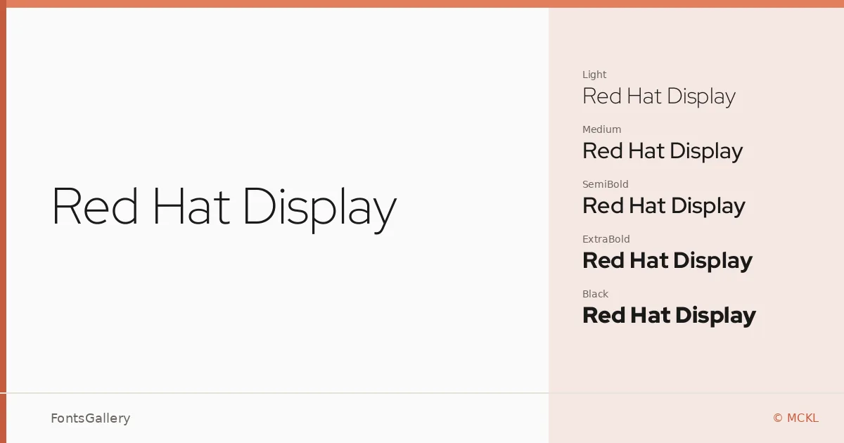
About Red Hat Display Font
There is a quiet confidence to these letterforms — geometric but not cold, engineered but not mechanical. Designed by Pentagram and MCKL for The Red Hat Project, this display-oriented sans serif carries the kind of institutional clarity you expect from a commissioned identity typeface, while remaining open enough to travel well beyond its origins.
Design Aesthetics & Character Characteristics
The family runs from Light through Black, with upright and italic cuts at every weight, plus variable font files that give you the full range in a single TTF — a genuinely useful thing when you are working across responsive environments. The forms sit in a modern, minimal register: consistent stroke contrast, clean terminals, and proportions that hold up at large display sizes without feeling oversized at moderate ones. It reads as professional without being stiff, and bold without shouting.
Recommended Usage & Font Pairing
The weight range and tight construction make it a natural fit for branding systems, magazine headlines, website headers, and presentation decks — anywhere Latin-script hierarchy needs to work quickly and reliably. The heavier cuts, ExtraBold and Black, carry real presence for editorial splashes, while Light and Regular settle comfortably into secondary display roles. It pairs well with the contrast-rich curves of Canela, the personality of Allura, the energy of 321 Impact, the refined structure of ABC Arizona, and the decorative warmth of Vintage Melinda.
License & Usage Terms
Released under the SIL Open Font License, Version 1.1, which permits commercial use — full details at https://openfontlicense.org. Embedding is set to installable, so you can bundle it freely in documents and applications.