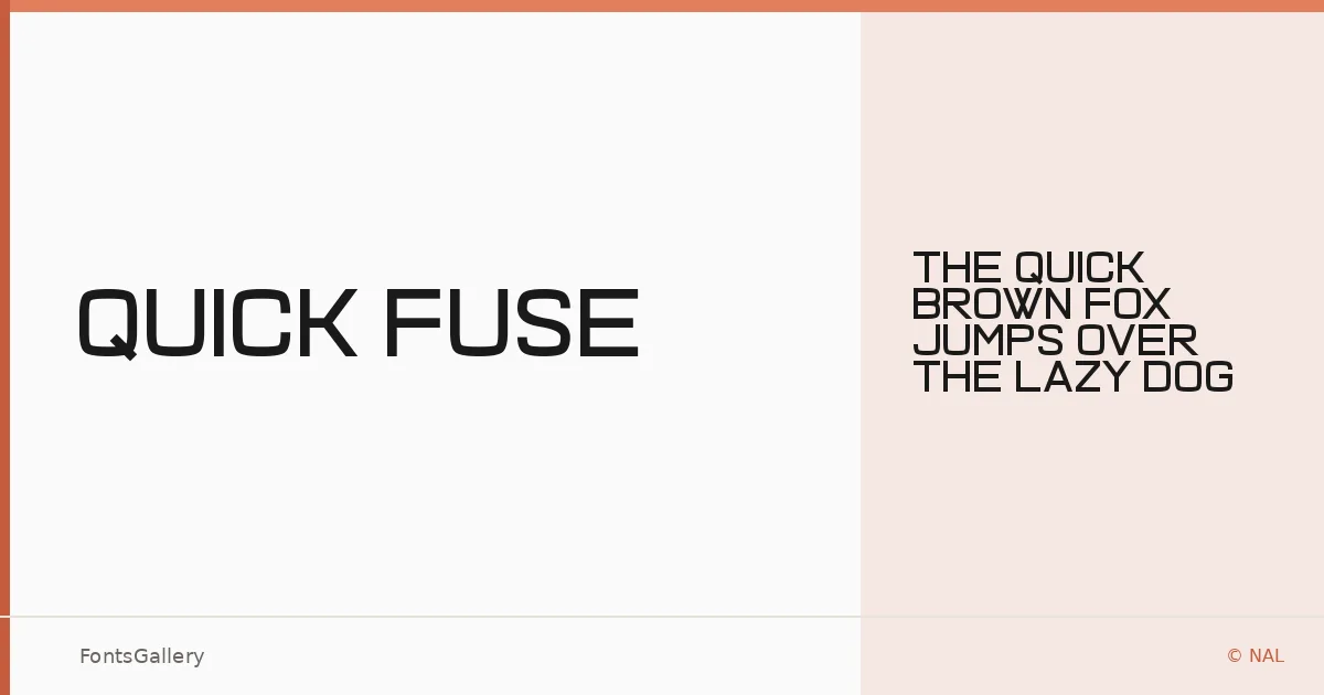
About Quick Fuse Font
There is a clean tension to these letterforms — the kind that comes from stripping a sans serif down to its structural essentials and letting the weight do the talking. Quick Fuse is a single-weight sans serif designed by NAL of Chequered Ink, built in a single Regular cut and released in OTF format.
Design Aesthetics & Character Characteristics
The face sits confidently in bold, minimal territory: modern in construction, professional in bearing, and uncluttered enough to hold its own at large sizes. With only the one Regular style in the family, every decision about emphasis falls to scale, spacing, and composition rather than weight variation — which actually suits headline and display work rather well. The forms feel purposeful, with the kind of quiet geometry that reads as authoritative without being cold.
Recommended Usage & Font Pairing
This is a face built for high-visibility work: poster headlines, logo lockups, advertising copy, and branding contexts where a bold, modern presence is the goal. It pairs well alongside Canela, Armelie, 321 Impact, ABC Arizona, and Kactigona — a range of companions that can supply the contrast in weight or personality that a single-cut display face often needs.
License & Usage Terms
Quick Fuse is available under Personal Use terms — commercial use is not permitted, so confirm your licensing situation before committing it to a client job. Embedding is set to installable.