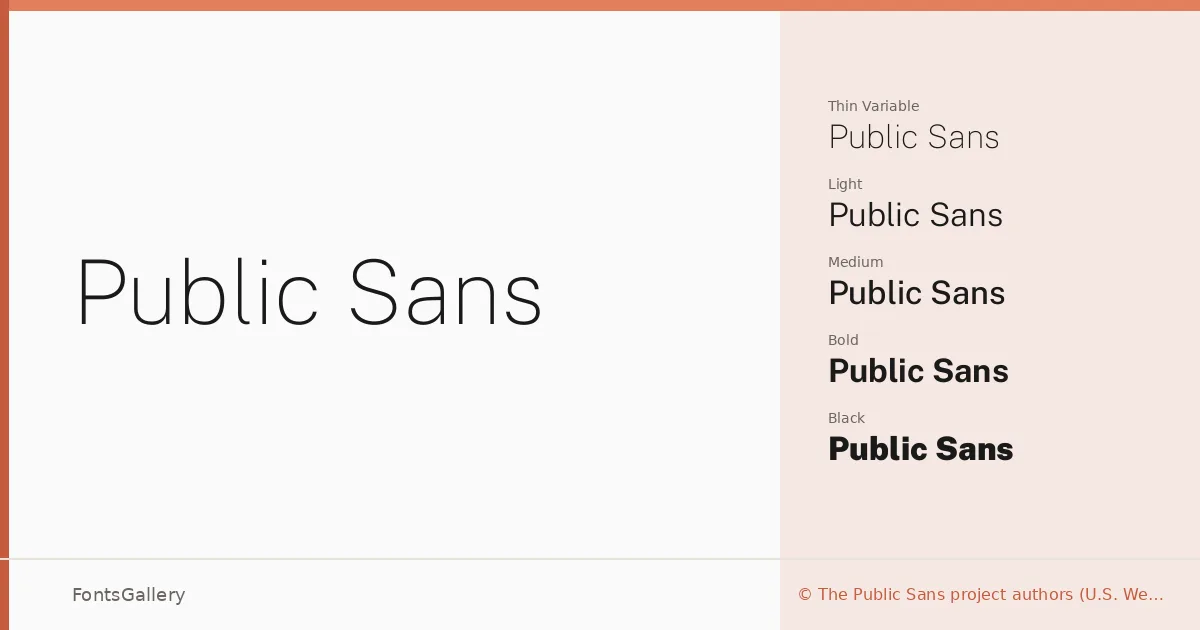
About Public Sans Font
There is a deliberate restraint to this sans-serif — clean terminals, even stroke weight, and just enough personality to read as considered rather than generic. Public Sans was developed by the U.S. Web Design System project authors, growing out of Libre Franklin, itself a reinterpretation of Morris Fuller Benton's 1912 classic expanded by Pablo Impallari and Rodrigo Fuenzalida. The lineage gives it a grounded, institutional confidence without feeling stiff.
Design Aesthetics & Character Characteristics
The family sits comfortably in the modern, minimal, professional register — the kind of face that disappears into the work in the best possible way. The range runs from Thin and ExtraLight through Regular and Medium up to ExtraBold and Black, each weight accompanied by a matching italic, and the whole system is also available as a variable font covering that same span with its italic counterpart. In TTF format across all cuts, the spacing is open and the proportions neutral enough to hold up at small sizes as well as large display settings.
Recommended Usage & Font Pairing
The breadth of weights makes it well-suited to branding systems, business cards, magazine layouts, and presentation decks where hierarchy needs to be built from a single coherent type family. It covers Latin, partial Latin Extended, and Vietnamese, which gives it real reach for multilingual publishing work. For contrast, the listed pairings — Canela, Armelie, 321 Impact, AQUA, and Kactigona — each bring a different texture, from editorial warmth to display energy, that plays productively against this family's neutrality.
License & Usage Terms
Released under the SIL Open Font License, Version 1.1, commercial use is permitted and embedding is set to installable; note that the USWDS modifications to the project carry their own license terms available at the repository linked in the full license documentation.