About Proxima Nova Font
There is a particular tension in this sans serif — it sits somewhere between the geometric clarity of mid-century American gothics and the humanist warmth that makes body copy breathable. Mark Simonson, working under his own Mark Simonson Studio LLC, drew a family that resolves that tension rather than choosing sides. The result is a face whose proportions feel deeply considered: open apertures, consistent stroke contrast, and a neutrality that reads as authority rather than blandness.
Design Aesthetics & Character Characteristics
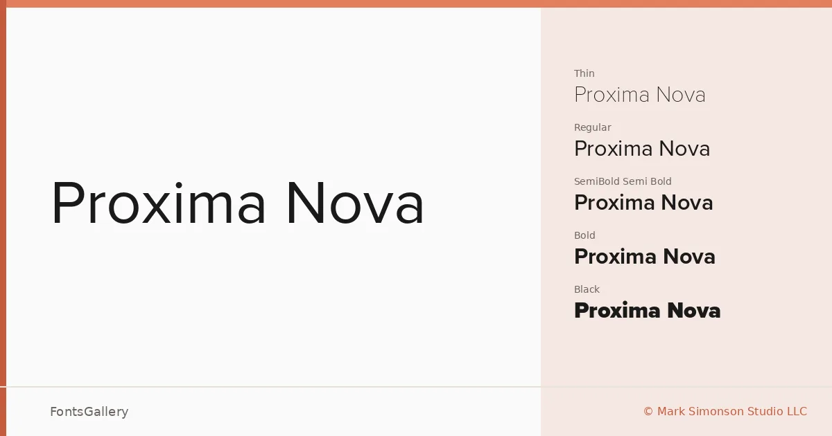
The family spans a serious range — Thin through Black, with upright and italic companions at each weight, plus Condensed cuts at Bold and Black for situations where horizontal space is tight. That gives you twenty styles in OTF format. The overall mood is modern and professional, leaning minimal without ever becoming cold. At heavy weights it carries real presence; at Thin and Light it becomes quiet enough to disappear into a grid.
Recommended Usage & Font Pairing
The weight range makes it a natural fit for branding systems, magazine layouts, presentation decks, and website headers where hierarchy needs to be built from a single family. The Condensed Black is particularly useful for advertisement headlines where impact has to survive a small footprint. If you want to introduce contrast on the page, the listed pairing options — Anglecia Pro, Ballmain, 321 Impact, AQUA, and Batoshi — each bring a different kind of counterpoint, from serif elegance to display energy.
License & Usage Terms
These files are offered under a Demo license, which does not allow commercial use — confirm terms with Mark Simonson Studio LLC at marksimonson.com/info/licenses before deploying on any paid job. Embedding is permitted at the editable level.