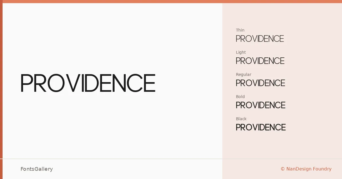
About Providence Font
There is a quiet confidence to this sans serif — the kind that comes from restraint rather than decoration. Designed by Frada Nanda at NanDesign Foundry, it draws its strength from clean geometry and measured spacing that holds together across a wide range of sizes. Every cut in the family reads as intentional, nothing extraneous left in the letterforms.
Design Aesthetics & Character Characteristics
The family runs from Thin through Light, Regular, Bold, and Black — five weights that map a genuine range from delicate editorial use to punchy display settings. The overall character is modern and minimal, with an elegance that sits comfortably in professional contexts. At lighter weights the strokes have an almost typographic stillness; at Black they carry real authority without sacrificing the clean lines that define the family throughout. Files are available in both TTF and OTF formats.
Recommended Usage & Font Pairing
The weight range makes this family a natural fit for branding systems, magazine layouts, website headers, and logo work where a controlled, professional tone is essential. The lighter cuts work particularly well for headline hierarchies in editorial design, while Bold and Black anchor logo lockups without shouting. For pairing, the family sits well alongside contrasting text companions — Canela and ABC Arizona offer elegant serif counterpoints, Allura brings a calligraphic contrast for more expressive contexts, and 321 Impact or Ballmain can introduce graphic energy when the job calls for it.
License & Usage Terms
Providence is released under a Personal Use license — free for personal use, but commercial use is not permitted under these terms, so confirm licensing with NanDesign Foundry before committing it to a client project.