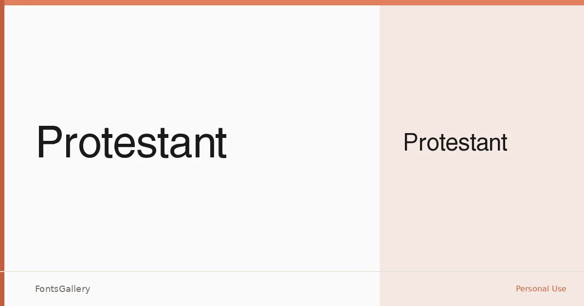
About Protestant Font
There is a deliberate restraint to these letterforms — clean strokes, controlled spacing, and a geometry that reads as intentional rather than incidental. Copyright is held by Digital Graphic Labs, dated 1998. The single Regular weight arrives as a TTF, built on a Latin character set.
Design Aesthetics & Character Characteristics
This is a sans serif drawn with a minimal hand and a professional composure — the kind of face that holds its ground at large sizes without shouting. Its classic proportions keep it from feeling coldly mechanical, while its modern edge prevents it from reading as nostalgic. You get one cut: Regular, which places the emphasis squarely on the quality of the line rather than range across weights.
Recommended Usage & Font Pairing
It earns its keep in branding, logo lockups, website headers, and presentation decks — anywhere that a headline needs to land cleanly and carry authority. The contained geometry pairs naturally with the contrast of Ballmain or the structural weight of 321 Impact, and it works alongside Aranea, Aresink, and Batoshi when a project calls for more personality in the supporting type.
License & Usage Terms
This family is released under a Personal Use license, which means it is not cleared for commercial work — confirm usage rights before placing it in any client-facing or revenue-generating project. Embedding is permitted at the installable level.