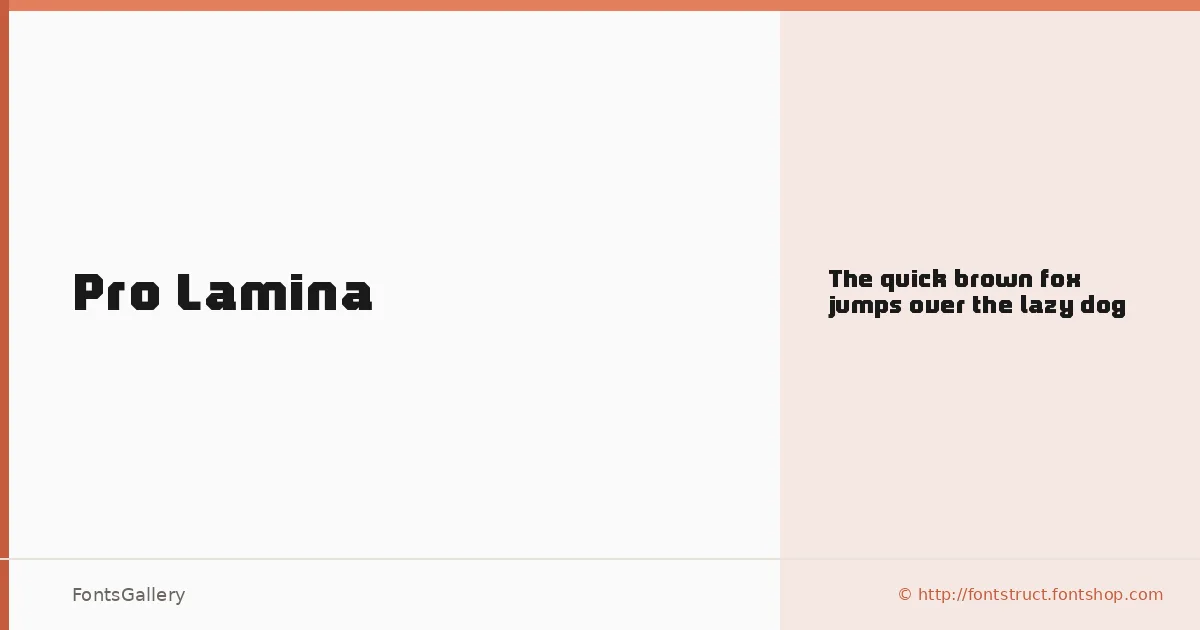
About Pro Lamina Font
There is a deliberate economy to these letterforms — clean, modular strokes held to a strict geometry with very little concession to warmth or flourish. Alejandro Cabrera Avila built this Latin-script sans through FontStruct, and that constructive, tile-based method shows in the measured regularity of every curve and terminal. The result is a single-weight face that earns its confidence through restraint rather than volume.
Design Aesthetics & Character Characteristics
The family ships as a single Regular weight in TTF format, which means it is a study in what one cut can do when the design carries its own authority. The mood is minimal and modern with an underlying professionalism — the kind of letterform that holds its shape at large sizes without needing contrast or ornamentation to give it presence. Optically it reads bold in intent even without a bold sibling, making it feel punchy in display contexts while remaining legible and composed.
Recommended Usage & Font Pairing
This face is best deployed where scale and brevity work together: branding marks, poster headlines, website headers, and logo lockups where Latin-script coverage is sufficient. It pairs well with the editorial softness of Canela or ABC Arizona, the script warmth of Armelie, and holds its ground alongside contrasting textures like Minecraft or Kactigona — any of those combinations letting the geometric rigidity of this face do its structural work while the companion handles tone or hierarchy.
License & Usage Terms
Pro Lamina is available for commercial use under the Creative Commons Attribution Share Alike license (CC BY-SA 3.0); note that embedding is permitted for preview and print only, so factor that into any interactive or web-embedding workflow.