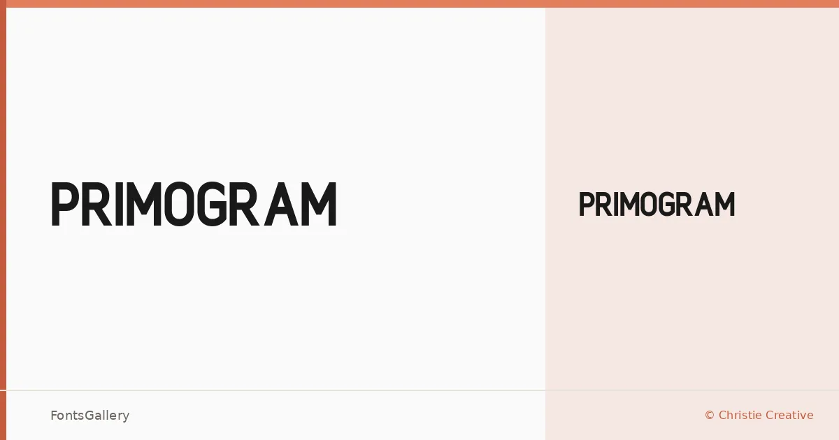
About Primogram Font
There is a deliberate confidence to this sans serif — clean terminals, controlled proportions, and a geometry that reads as intentional rather than incidental. Alexa Christie, working under Christie Creative, designed it as a single-weight cut: Primogram Regular, available in both TTF and OTF formats.
Design Aesthetics & Character Characteristics
The design sits in that productive space between minimal restraint and bold presence — modern enough for contemporary branding work, professional enough to hold up in formal contexts. A single Regular weight means everything depends on the letterforms themselves, and they carry the load well, with a clarity that suits headline sizes where individual characters are read closely rather than skimmed.
Recommended Usage & Font Pairing
This face earns its keep in logo lockups, poster headlines, and business card nameplates — anywhere a clean, unhurried weight needs to anchor a layout. For body copy contrast, it has been paired with the serif warmth of Canela or Times New Roman; for something more expressive alongside it, Angeletta and Armelie introduce calligraphic tension, while Minecraft offers a harder-edged stylistic counterpoint.
License & Usage Terms
Primogram is released under Personal Use terms — commercial use is not permitted, so confirm licensing directly with Christie Creative before deploying it in a paid project.