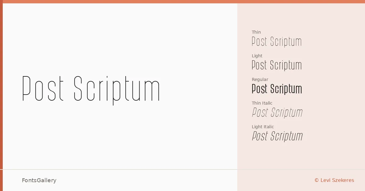
About Post Scriptum Font
There is a restraint to this family that takes a moment to appreciate — the strokes are measured, the spacing considered, and nothing reaches for attention it hasn't earned. Created by Levi Szekeres, whose work appears under the Lorem Ipsum foundry, the design sits at an unusual intersection: a sans serif that carries the composure of classical type without mimicking historical models. The copyright span of 1990–2015 suggests a face that was refined slowly rather than rushed to release.
Design Aesthetics & Character Characteristics
The family runs from Thin through to Regular, covering Thin, Thin Italic, Light, Light Italic, Italic, and Regular — a set weighted toward the lighter end of the spectrum, which suits its minimal, elegant character well. The forms lean modern but never cold; there is a classic legibility in the proportions that holds up at small sizes as well as it does blown out on a poster. Available as TTF files, the family extends beyond Latin to cover Latin Extended (partially), Vietnamese (partially), Cyrillic, and Greek, giving it meaningful reach across a range of editorial contexts.
Recommended Usage & Font Pairing
The lighter weights feel especially well-suited to magazine layouts, website headers, and branding work where the type needs to carry refinement without heaviness; the Regular holds its own on a business card or poster where a clean, modern voice is called for. When you need contrast, it pairs naturally with serif and display faces — Canela, Rasley Heights, and Times New Roman all offer the tonal shift that keeps a layout from feeling monotone, while Angeletta and Dharma Gothic E bring texture and personality as counterpoints to its quieter rhythm.
License & Usage Terms
This family is available under Personal Use terms only — commercial use is not permitted, so confirm licensing directly with Levi Szekeres at [email protected] before deploying it in any client or revenue-generating work. Embedding is permitted at the installable level.