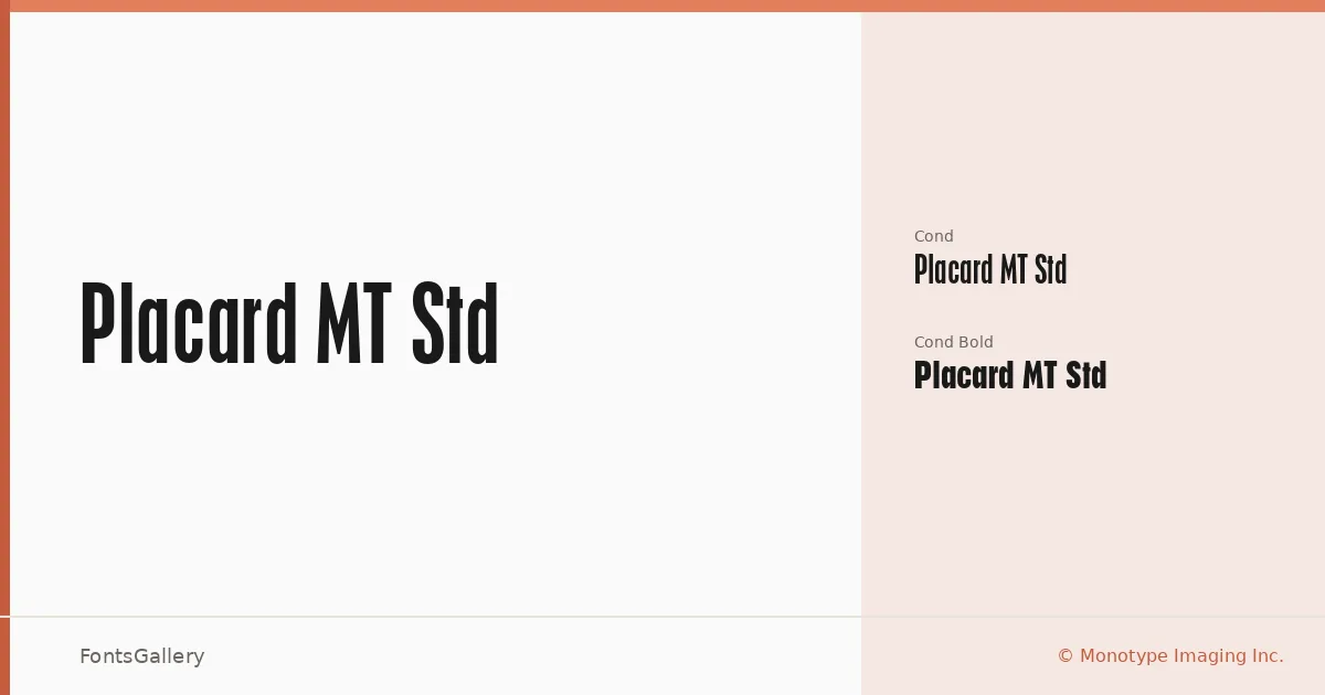
About Placard MT Std Font
The drawings behind this family arrived from Germany, and the influence shows: narrow, heavy, unapologetically utilitarian letterforms built for maximum impact at display sizes. Developed by the Monotype Design Studio, the design carries a large x-height with deliberately short ascenders and descenders — a combination that lets lines of type pack together tightly without losing legibility or presence.
Design Aesthetics & Character Characteristics
Both cuts — Regular Cond and Bold Cond — sit firmly in the condensed sans serif tradition, carrying a mood that reads as bold and modern while retaining something unmistakably vintage in its heritage. The compression is the whole point: these are not display faces that happen to be narrow, but faces designed from the start for headline and advertising work where column width is precious and force is non-negotiable. Delivered as OTF files, the two weights give you a functional range within a tight, disciplined envelope.
Recommended Usage & Font Pairing
Posters, signage, branding campaigns, and advertisement headlines are exactly the terrain where this family earns its keep — anywhere Latin-script copy needs to command attention in a confined space. The condensed structure makes it natural for multi-deck poster layouts or tall, narrow banner formats. Among the named pairing options, the organic curves of Armelie or the editorial weight of Canela offer strong contrast, while Urban Thunder Demo, AQUA, and Kactigona can push the combination further toward expressive or street-level aesthetics.
License & Usage Terms
This family is available under Personal Use terms only — confirm commercial rights directly with Monotype Imaging Inc. before committing it to a paid job, as the EULA governs all use; embedding is limited to preview and print only.