About Paytone One Font
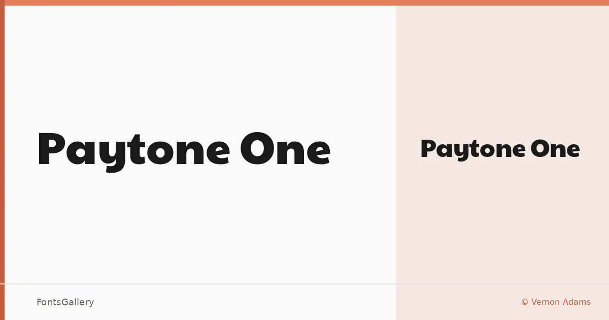
There is a density to this single weight — a confidence in the stroke that reads as a shout even at small sizes. Designed by Vernon Adams, it arrives as one cut, Regular, built for situations where the type needs to carry the room. The letterforms are wide, the counters open, and the overall texture sits somewhere between a display grotesque and a display face with genuine personality.
Design Aesthetics & Character Characteristics
This is a sans serif with a bold, modern, and playful disposition — the kind of face that makes a headline feel intentional rather than incidental. Because the family ships as a single Regular style in TTF format, there is no Light-to-Black range to navigate; the weight is fixed, and the whole exercise is about what that single weight can do. The curves are generous, the spacing loose enough to breathe, and the overall rhythm rewards large-scale setting where individual letterforms can land with full impact. Latin and Latin Extended characters are included, along with Vietnamese, making it workable across a meaningful range of languages that share those scripts.
Recommended Usage & Font Pairing
Posters, advertising campaigns, logos, and brand headlines are where this face earns its keep — anywhere the visual hierarchy demands a single dominant line of type that reads instantly. It sits well alongside Canela for an editorial contrast of mass against elegance, or next to Armelie when a script complement is needed. For layered display work, 321 Impact, AQUA, and Kactigona each offer different directions — structural tension, color, or decorative counterpoint.
License & Usage Terms
Released under the SIL Open Font License, Version 1.1, which permits commercial use — full terms and FAQ are available at https://scripts.sil.org/OFL. Embedding is set to installable, so the font may be embedded freely in documents and applications.