About Panton Font
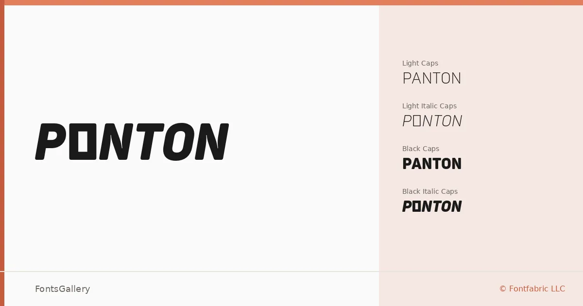
There is something deliberately spare about the way these narrow cuts hold their ground — condensed proportions with a clean geometric sensibility that feels thoroughly considered rather than merely compressed. Ivan Petrov and Svet Simov of Fontfabric LLC built this family around a modern, elegant sans-serif structure, and the all-caps alternates woven into each style make clear that display hierarchy was central to the brief from the start.
Design Aesthetics & Character Characteristics
The family arrives in four OTF styles: Panton Narrow Light, Panton Narrow Light Italic, Panton Narrow Black, and Panton Narrow Black Italic — each carrying companion caps variants. The spread between Light and Black is dramatic, giving you a minimal, professional workhorse at one end and a bold, high-contrast presence at the other. Both weights share the same tight geometry, so they sit comfortably together without fighting. Coverage spans Latin and Cyrillic, which broadens the range of projects this family can take on.
Recommended Usage & Font Pairing
The condensed structure and strong weight contrast make this a natural fit for headlines, logos, branding systems, advertisements, and business cards where space is tight but presence matters. The Black cuts command attention in large display settings; the Light reads with restrained professionalism at smaller headline sizes. It pairs well with the editorial softness of Canela, the calligraphic warmth of Angeletta or Armelie, and holds its own alongside more familiar choices like Times New Roman.
License & Usage Terms
This family is available under a Demo license, which covers personal use only — confirm licensing terms with Fontfabric LLC before applying it to any commercial job. Embedding is permitted at the editable level.