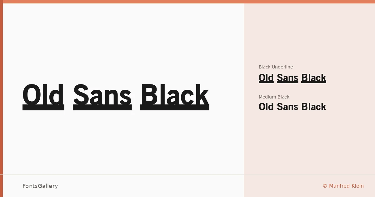
About Old Sans Black Font
There is a density to these letterforms that announces itself immediately — thick strokes, confident geometry, and a vintage industrial character that feels drawn from early commercial printing rather than the clean rationalism of modern grotesques. The family was designed by Manfred Klein, and the copyright dates it to October 2003. It arrives in TTF format and covers Latin script.
Design Aesthetics & Character Characteristics
This is a sans serif built for weight and presence, offered in two cuts: Old Sans Black at a medium black, and Old Sans Black Underline, which adds a built-in underline to that same black weight. The mood is bold and classic, with a professional gravity that tips readily into vintage territory — the kind of letterform you might find on an early twentieth-century trade card or a transit poster. Both styles share the same dense, commanding proportions; the underline variant simply doubles down on the graphic intensity.
Recommended Usage & Font Pairing
The weight and vintage character make it most at home in headlines, posters, advertisements, and branding or logo work where you need a face that holds the room. It pairs with Canela, Armelie, Minecraft, ABC Arizona, and Kactigona — a range that lets you contrast its heavy, old-press energy against everything from elegant editorial serif cuts to playful or geometric companions.
License & Usage Terms
Old Sans Black is available for commercial use, and embedding is permitted at the installable level, so you can distribute documents and applications with the font embedded without restriction.