About Nunito Sans Font
There is a quiet confidence to these letterforms — rounded terminals kept in check by clean, open spacing that never tips into softness. Vernon Adams designed the family, and the result is a well-mannered geometric sans that holds its own at display sizes without losing readability in running text. The variable format means you are working with a continuous range of weight rather than a fixed ladder of cuts.
Design Aesthetics & Character Characteristics
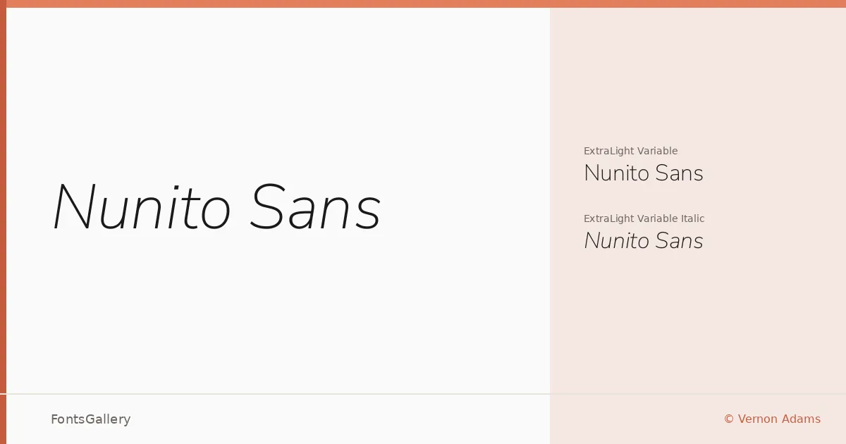
The family ships as two variable files — ExtraLight Variable and ExtraLight Variable Italic — covering the full weight axis in TTF format. The mood sits squarely in elegant and minimal territory: strokes are even, proportions are generous, and nothing shouts for attention. That restraint is precisely what makes it feel modern and professional across contexts. The Italic companion carries the same even-handed geometry, leaning just enough to signal emphasis without breaking the visual rhythm.
Recommended Usage & Font Pairing
The measured, open construction lends itself naturally to branding systems, business cards, magazine layouts, presentation decks, and website headers — anywhere that clean hierarchy matters more than expressive personality. Language support spans Latin, partial Latin Extended, Vietnamese, and Cyrillic, which gives it useful reach across multilingual projects. For pairing, it sits comfortably alongside Canela or ABC Arizona when you want contrast with a serif, and lifts nicely against the script energy of Allura or Vintage Melinda. 321 Impact provides a blunter, heavier counterpoint for moments that need raw punch.
License & Usage Terms
Nunito Sans is released under the SIL Open Font License, Version 1.1, which permits commercial use — full terms and FAQ are available at https://scripts.sil.org/OFL. The embedding permission is set to installable, so you can embed it freely in PDFs and applications.