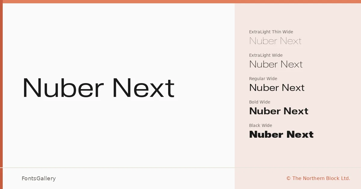
About Nuber Next Font
There is a particular discipline to the letterforms here — smooth, even strokes drawn from a geometric grid, with low contrast and a steady, unhurried rhythm that owes a clear debt to neo-grotesque tradition and the early Swiss type foundries. Jonathan Hill of The Northern Block Ltd. built this family on those foundations, arriving at shapes that feel rigorously constructed without ever feeling cold. The result is a sans serif that holds its composure across sizes.
Design Aesthetics & Character Characteristics
The family spans nine weights — Thin through Black — and each weight is extended across five widths: Compressed, Condensed, Regular, Extended, and Wide, all with matching italics, giving you ninety cuts in total delivered as OTF files. That systematic width axis is where the design really earns its keep: the Compressed weights read as tight and authoritative in headlines, while the Wide variants breathe easily across a masthead or logo lockup. Throughout, the geometry stays honest — minimal quirks, uniform spacing, the kind of professional restraint that reads as modern without chasing a trend.
Recommended Usage & Font Pairing
The weight and width range makes this a strong choice for branding systems, magazine layouts, website headers, and logo work where you need a single family to carry both display and supporting roles. The bold compressed cuts land hard in headlines; the lighter extended weights work well as secondary typographic voices in the same layout. For contrast-driven pairings, the listed companions include Canela, Armelie, Urban Thunder Demo, AQUA, and Kactigona.
License & Usage Terms
This family is available under a Personal Use license, which means commercial use is not permitted — confirm licensing terms at thenorthernblock.co.uk before taking it into a client or revenue-generating project. Embedding is restricted to preview and print only.