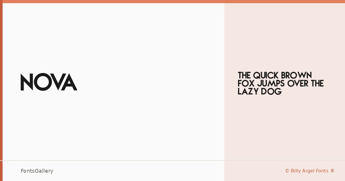
About NOVA Font
There is a clean authority to this sans serif that announces itself without noise — the kind of weight and restraint that makes a headline feel settled rather than aggressive. Released under Billy Argel Fonts ®, it arrives as a single OTF cut: Regular Regular, which means the design carries everything on one set of shoulders.
Design Aesthetics & Character Characteristics
The forms sit squarely in minimal, modern sans serif territory — geometric enough to read as professional, stripped enough to stay out of its own way. That single Regular weight is no limitation when the letterforms are drawn with this kind of presence; it suits bold display work precisely because the proportions and spacing do the heavy lifting without needing additional cuts. Think of it as a face built for Latin-script work where clarity and confidence matter above all else.
Recommended Usage & Font Pairing
The natural home here is large-scale: poster headlines, magazine covers, logo lockups, and branding contexts where a strong, uncluttered word mark needs to hold attention. For contrast in a layout, the listed companion faces — Anglecia Pro, Ballmain, 321 Impact, AQUA, and Batoshi — offer a range of tonal options worth exploring alongside it.
License & Usage Terms
This family is offered under Personal Use terms, which means commercial use is not permitted — confirm licensing directly with Billy Argel Fonts ® before placing it in any client or revenue-generating work. Embedding is restricted under the current license.