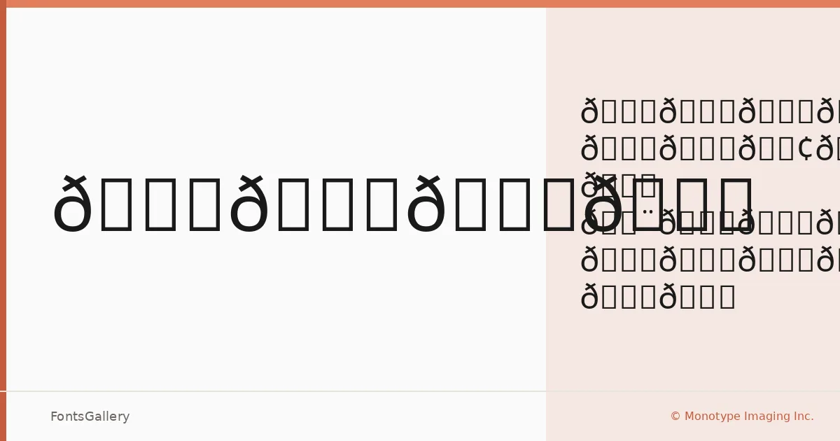
About Noto Sans Avestan Font
There is a deliberate restraint to this design — clean strokes, open counters, and a neutrality that sits quietly on the page without competing with content. Developed by the Monotype Design Team, Noto Sans Avestan brings that same disciplined, unadorned construction the Noto project is known for, arriving in a single Regular weight delivered as a TTF file.
Design Aesthetics & Character Characteristics
The family sits squarely in the sans serif category, carrying a mood that reads as classic and professional without tipping into stiffness — minimal enough for modern layouts, grounded enough for formal contexts. With one weight in the family, the Regular does its work through proportion and spacing rather than contrast between cuts. The letterforms are even-tempered and upright, the kind of face that holds Latin text steadily across running copy or display use alike.
Recommended Usage & Font Pairing
Its composed, professional character makes it a natural fit for book covers, magazine layouts, presentation decks, and website headers — anywhere the type needs to carry authority without drawing attention to itself. For pairings, the family works alongside Aresink, Ballmain, 321 Impact, Bizantheum, and Batoshi, giving you options that range from complementary neutrality to deliberate contrast depending on the job.
License & Usage Terms
Released under the SIL Open Font License, Version 1.1, commercial use is permitted; full terms and the accompanying FAQ are available at https://scripts.sil.org/OFL. Embedding is set to installable, so the font may be bundled within documents and applications.