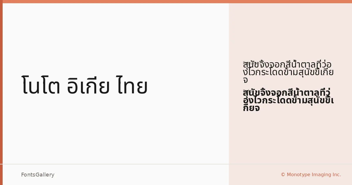
About Noto IKEA Thai Font
There is a deliberate clarity to these letterforms — clean terminals, even stroke weight, and the kind of structural honesty that sits comfortably across both Thai and Latin scripts without forcing either to compromise. The family was drawn by the Monotype Design Team, and it carries that studio's characteristic discipline: nothing is decorative that does not need to be. Coverage spans Latin, Latin Extended, Vietnamese, Cyrillic, Greek, and Thai, making it a genuinely multilingual tool rather than a Latin face with token additions.
Design Aesthetics & Character Characteristics
This is a sans serif built around minimal interference — modern in proportion, professional in bearing, and bold enough in character to hold its own at large sizes without feeling heavy at text weight. The family ships in two cuts, Regular and Bold, as TTF files, which keeps the weight range focused rather than sprawling. The move from Regular to Bold is confident and deliberate, lending itself naturally to hierarchy-driven layouts where contrast needs to do real work.
Recommended Usage & Font Pairing
The combination of Thai and extended Latin coverage makes it well-suited to signage, branding, website headers, and advertising work that needs to operate across multiple writing systems without visual inconsistency. It handles presentation decks and institutional materials with the same ease. For pairing, the clean geometry here plays well against the editorial warmth of Canela, the expressive personality of Armelie, or the structured confidence of ABC Arizona; 321 Impact and Kactigona offer more contrast for campaigns that need a harder edge.
License & Usage Terms
This family is released under the SIL Open Font License, Version 1.1, on personal-use terms — commercial use is not permitted under the current listing, so confirm licensing arrangements before deploying it on a paid job. Embedding is set to installable.