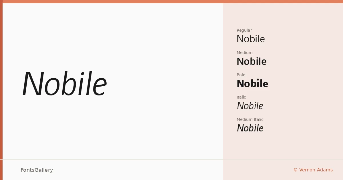
About Nobile Font
There is a quiet confidence to this sans serif — upright, measured, with letterforms that hold their ground without ever raising their voice. Released by Vernon Adams, the family covers both Latin and Cyrillic scripts in TTF format, making it genuinely useful across a range of editorial and interface work.
Design Aesthetics & Character Characteristics
The design sits squarely in the classic-to-modern range: minimal in detail, professional in bearing, and clean enough to read without friction at display sizes. The family spans Regular, Regular Italic, Medium, Medium Italic, Bold, and Bold Italic — a compact but well-considered set that gives you enough range to build a clear typographic hierarchy without reaching for anything else. The stroke contrast is low and the proportions are generous, which keeps it grounded rather than cold.
Recommended Usage & Font Pairing
It earns its keep in branding systems, magazine layouts, presentation decks, and website headers — anywhere a headline needs authority without decoration. The Cyrillic coverage extends its reach into multilingual projects without compromise. For contrast-driven pairings, the listed companions include Canela, Allura, 321 Impact, ABC Arizona, and Ballmain, each pulling in a different direction and giving you options from editorial warmth to display weight.
License & Usage Terms
Released under the SIL Open Font License, which permits commercial use — and the embedding permission is set to installable, so you can embed it in documents and applications freely.