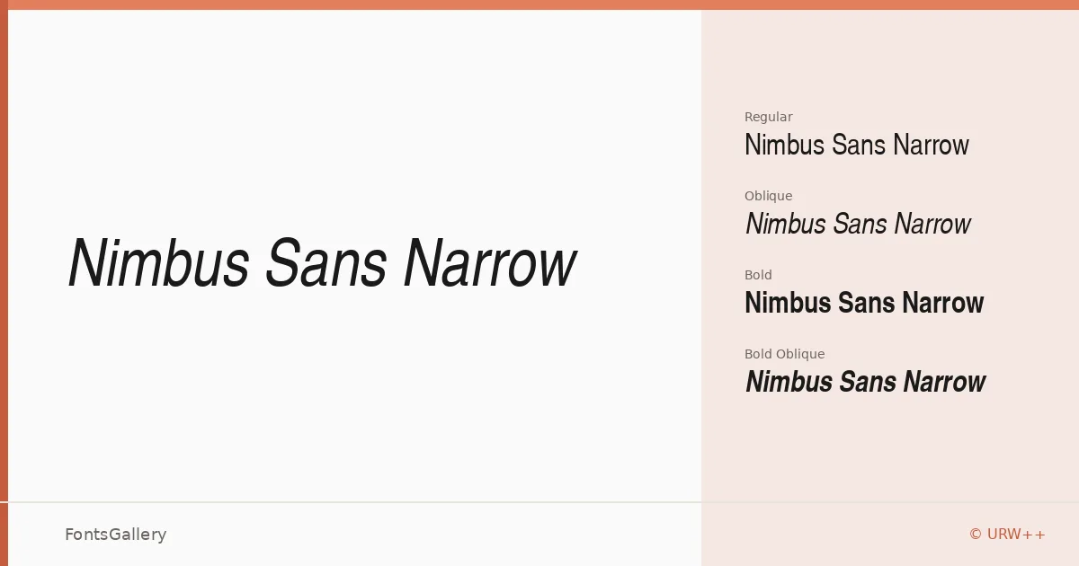
About Nimbus Sans Narrow Font
Condensed geometry is the first thing you notice: each letter sits close to its neighbors, economical and upright, with the kind of rational structure that URW++ has long understood how to execute cleanly. The family covers Regular, Regular Oblique, Bold, and Bold Oblique — a compact but complete set that handles both text and display work without fuss. Files are available in both TTF and OTF formats.
Design Aesthetics & Character Characteristics
The mood here is minimal and professional, with the narrowed proportions adding a quiet tension that reads as modern rather than cold. Regular and Bold carry enough optical contrast between them that hierarchy comes naturally, and the oblique cuts lean without theatrics. Across all four styles, the letterforms hold their composure at large sizes, which is exactly where condensed sans faces tend to either shine or fall apart — this one shines. Language support spans Latin, Cyrillic, and Greek, making it genuinely useful across European editorial and commercial contexts.
Recommended Usage & Font Pairing
The narrow footprint earns its keep in headlines, magazine layouts, signage, and advertisement work where column inches matter and weight still needs to read at a distance. Branding applications benefit from the disciplined, no-excess character — nothing here competes with the mark it's meant to support. For pairing, the rational structure sits well alongside the editorial warmth of Canela or ABC Arizona, while more expressive choices like Armelie or Kactigona create productive contrast against the family's restraint; Minecraft pairings lean into the geometric angle.
License & Usage Terms
This family is available for commercial use under its stated license. Note that embedding is permitted for preview and print only, so confirm those terms before delivering interactive or app-based work.