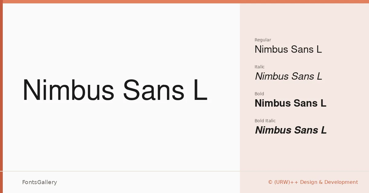
About Nimbus Sans L Font
There is a controlled steadiness to these letterforms — the kind that comes from a tradition of rigorous geometric-influenced sans-serif design, refined over decades by (URW)++ Design & Development. The family arrives in four cuts: Regular, Regular Italic, Bold, and Bold Italic, all in OTF format. The proportions are even and unhurried, with a neutrality that holds up under pressure without ever feeling cold.
Design Aesthetics & Character Characteristics
The mood sits squarely in classic, minimal, professional territory — modern in its economy, but without any of the fashionable quirkiness that dates quickly. The Regular carries a clean, open rhythm that reads comfortably at both text and display sizes, while the Bold has enough weight to anchor a hierarchy without forcing the issue. The italic cuts lean gently rather than dramatically, keeping the overall tone composed and business-like. Script coverage extends across Latin, Cyrillic, and Greek, which broadens its usefulness considerably beyond English-language work.
Recommended Usage & Font Pairing
It earns its keep in branding systems, business cards, magazine layouts, presentations, and advertising — anywhere a professional, unobtrusive presence is an asset rather than a concession. The multilingual range makes it a practical choice for international campaigns and publications without requiring a font swap mid-document. For pairing, it works well alongside the editorial warmth of Canela or ABC Arizona, the decorative contrast of Armelie or Kactigona, and the blunt impact of 321 Impact when a harder typographic punch is needed.
License & Usage Terms
Nimbus Sans L is released under the GNU General Public License, which allows commercial use. Embedding is permitted at the installable level, so documents and applications can include the font without restriction beyond the license terms.