About Nexa Font
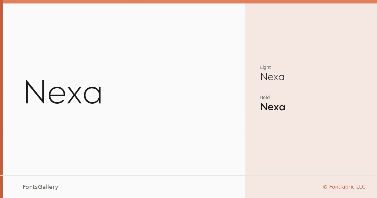
There is a particular confidence in the way this geometric sans-serif carries its weight — open apertures, clean terminals, and proportions that feel resolved rather than compromised. Svet Simov at Fontfabric LLC drew it with a minimal hand, stripping away anything that doesn't serve the form. The result lands somewhere between functional clarity and quiet elegance.
Design Aesthetics & Character Characteristics
The family ships in two cuts — Light and Bold — and the contrast between them is genuinely useful: the Light has an airy, refined presence while the Bold asserts itself without heaviness. Both are delivered as OTF files with Latin coverage. The overall mood sits firmly in modern and professional territory, which makes the pairing of the two weights feel like a complete toolkit for clean, structured work rather than a half-finished range.
Recommended Usage & Font Pairing
Its geometry reads well at the scale of a logo or website header, and the Light weight brings enough restraint for business cards and presentation decks where breathing room matters. Branding work is where the interplay between the two cuts earns its keep. For pairings, the family has been seen working alongside Canela, ABC Arizona, and Armelie for editorial warmth, or set against Kactigona and Minecraft when a project calls for something with more personality in the body or accent type.
License & Usage Terms
This family is offered under a Demo license — personal-use terms apply, and embedding is permitted for preview and print only, so confirm the licensing situation with Fontfabric LLC before committing it to any commercial job.