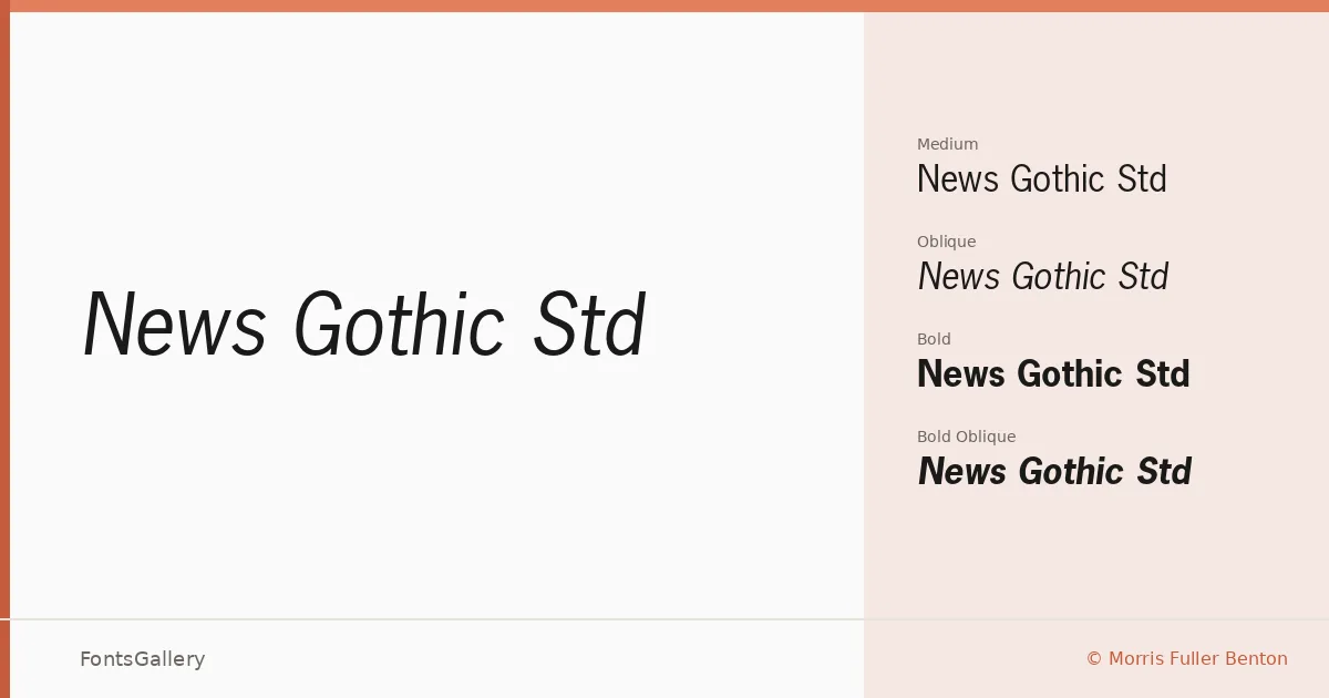
About News Gothic Std Font
There is something immediately recognizable about the even, unadorned strokes of Morris Fuller Benton's American gothic — a clarity that has kept it at home in newsrooms, ad agencies, and design studios for well over a century. This family is distributed through Adobe's type library as an OTF collection, carrying copyright notices spanning 1987 through 2002. The letterforms sit squarely in the grotesque tradition: slightly condensed proportions, modest contrast, and terminals cut with a workmanlike confidence rather than fussiness.
Design Aesthetics & Character Characteristics
The family comes in four cuts — Regular, Regular Oblique, Bold, and Bold Oblique — which is a lean but honest range for a sans serif built around professional directness. The overall mood reads as classic and modern in the same breath: bold enough for headlines, restrained enough for body-level branding copy. The obliques are mechanical slants rather than drawn italics, which keeps everything on the same no-nonsense register. Latin script coverage is what you get here, no more.
Recommended Usage & Font Pairing
It earns its keep in advertisement layouts, magazine headlines, signage systems, and branding work where legibility at scale matters more than warmth. The Bold weight commands attention on a poster or a masthead without needing decoration to do so. For contrast pairings, the listed companions — Canela, ABC Arizona, Angeletta, Armelie, and Minecraft — each bring something the gothic deliberately withholds, whether that is editorial serif elegance, script softness, or pixel-culture personality.
License & Usage Terms
This family is offered under Personal Use terms, which means commercial use is not permitted — confirm licensing with Adobe at their type legal page before committing it to a paid project. Embedding is set to editable.