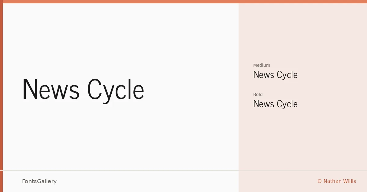
About News Cycle Font
There is something immediately legible about this face — a no-nonsense clarity that feels at home in environments where type has to work hard and fast. Designed by Nathan Willis, it carries the economy of newspaper typography without the fussiness that sometimes comes with it. The letterforms are open, upright, and confident, built for the kind of sustained reading attention that headlines and editorial layouts demand.
Design Aesthetics & Character Characteristics
This is a sans serif drawn along classic, minimal lines — professional in bearing without being cold. The family ships in two weights, Medium Regular and Bold, delivered as TTF files. The Regular carries enough visual mass to hold its own at display sizes, while the Bold pushes forward with the authority you want in a headline hierarchy. The overall character is modern in its restraint: few distractions, consistent stroke rhythm, and the kind of neutral composure that ages well.
Recommended Usage & Font Pairing
It earns its keep in magazine layouts, website headers, presentation decks, and signage — anywhere the type needs to read instantly and carry a sense of editorial credibility. Language coverage spans Latin, Latin Extended, Cyrillic, Greek, and Vietnamese and Coptic with partial support, making it a reasonable choice for multilingual editorial work across those scripts. For pairing, it sits comfortably alongside Canela or ABC Arizona when you want contrast with a more characterful serif, and holds its own next to Armelie, 321 Impact, or Kactigona when a more expressive companion is called for.
License & Usage Terms
News Cycle is released under the SIL Open Font License, Version 1.1, which permits commercial use and allows the font to be embedded, bundled, and redistributed freely — the one restriction is that the font software itself may not be sold on its own.