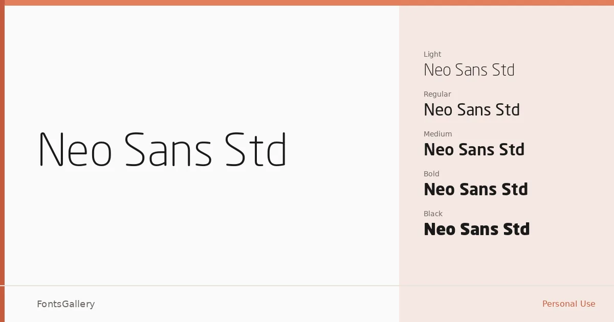
About Neo Sans Std Font
There is a particular kind of geometric sans that feels engineered rather than drawn, and Neo Sans Std sits squarely in that tradition — clean terminals, restrained curves, and a steadiness across every weight that reads as deliberately constructed. Copyright is held by Monotype Imaging, Inc. The letterforms carry just enough softness at the joints to keep them from feeling cold, which is rarer than it sounds in this category.
Design Aesthetics & Character Characteristics
This is a modern, minimal sans serif with a professional bearing that holds up whether it is set large or pushed into tight headline configurations. The family runs a full span from Light and Light Italic through Regular, Medium, Bold, and Black — each with a matching italic — and then stretches further into Ultra and Ultra Italic, giving you real range at the heavy end. All cuts are available as OTF files. At lighter weights the face reads with quiet confidence; at Ultra it becomes blunt and assertive without losing its structural logic.
Recommended Usage & Font Pairing
The weight range and that underlying geometry make this a natural fit for branding, logo work, advertisement layouts, and website headers where a strong Latin-script presence is needed. The heavier cuts command attention in headlines while the lighter weights hold their own in supporting roles. It pairs well with contrasting faces — the editorial softness of Canela, the script warmth of Angeletta or Armelie, the structured slab character of ABC Arizona, or the blunt novelty of Minecraft all create productive tension against its cool, rational structure.
License & Usage Terms
Neo Sans Std is available under a Personal Use license — commercial use is not permitted, so confirm the terms at the Monotype Imaging license page before applying it to any client or revenue-generating work. Embedding is restricted to preview and print only.