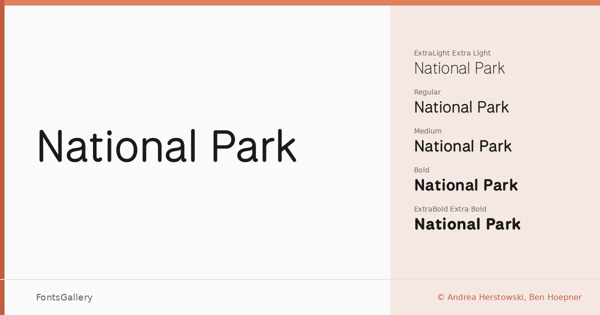
About National Park Font
There is a quiet confidence to this sans serif — the kind that comes from knowing exactly what it is and not trying to be anything else. Designed by Andrea Herstowski and Ben Hoepner, it covers Latin, partial Latin Extended, and Vietnamese, and arrives as a TTF family with a variable file included alongside the static cuts.
Design Aesthetics & Character Characteristics
The family runs from ExtraLight through ExtraBold — eight styles in all, including a variable font for fluid weight control — giving you a clean, minimal range that reads as both classic and modern without leaning too hard in either direction. The letterforms are geometric in feel but not rigid; there is just enough warmth in the strokes to keep large-scale settings from feeling cold. At display sizes the professional tone comes through immediately, and the lighter weights hold up well when the text needs to breathe.
Recommended Usage & Font Pairing
The weight range makes it well suited to branding systems, magazine layouts, poster work, and signage — anywhere a headline needs to carry authority without shouting. It also handles website headers cleanly, particularly in the variable format where weight can be tuned precisely. For pairing, the contrast-rich editorial texture of Canela works well against the neutrality here, and Armelie or ABC Arizona both offer interesting counterpoints; Kactigona and Minecraft push things in a more expressive direction when the job calls for it.
License & Usage Terms
National Park is released under the SIL Open Font License (OFL), Version 1.1, which permits commercial use and installable embedding — full terms and the accompanying FAQ are at https://openfontlicense.org.