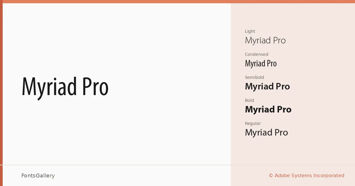
About Myriad Pro Font
There is a particular evenness to this sans-serif — a quietness in the stroke modulation and apertures that keeps it readable at a caption size and composed at a display size without changing its fundamental character. Designed by Robert Slimbach and Carol Twombly for Adobe Systems Incorporated, it belongs to a humanist tradition that softens the geometry of a modern grotesque without leaning into the warmth of a full text face. The result is a typeface that reads as neutral without feeling cold.
Design Aesthetics & Character Characteristics
The family ships as OpenType OTF and covers a meaningful range of work: Light, Regular, Regular Condensed, Regular Condensed Italic, SemiBold, SemiBold Italic, Bold, Bold Condensed, Bold Condensed Italic, and Bold Italic. That combination of weight and width axes gives a layout genuine flexibility — the condensed cuts hold well in tight columns and data-heavy environments, while the upright weights carry a minimal, professional tone across headings and body alike. The overall mood sits squarely at the intersection of classic and modern, neither dated nor fashionably quirky.
Recommended Usage & Font Pairing
The clean proportions make it a natural fit for branding systems, business cards, magazine layouts, presentation decks, and website headers where legibility and a composed, professional register are priorities. Language support extends across Latin, Vietnamese, Cyrillic, and Greek, which broadens its usefulness for multilingual editorial and corporate work. It pairs well with Canela, Armelie, 321 Impact, AQUA, and Kactigona, each offering enough contrast in personality to give a typographic system something to work against.
License & Usage Terms
Myriad Pro is available here under Personal Use terms — commercial use is not permitted under this license, so confirm clearance through Adobe at http://www.adobe.com/type/legal.html before deploying it on a paid project. The files carry editable embedding permissions.