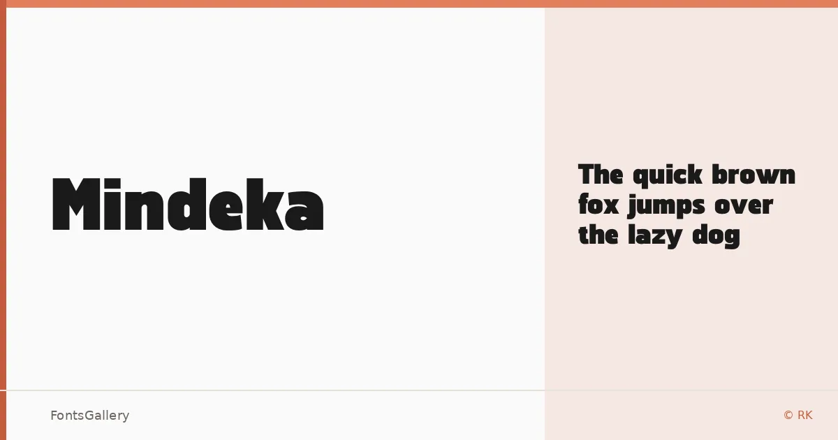
About Mindeka Font
There is a deliberate confidence to the letterforms here — clean geometry pulled tight, no excess anywhere. Designed by SidiqA under the RK foundry, this is a single-cut sans serif that earns its weight through proportion rather than decoration. The Regular weight carries itself with the kind of authority you usually expect from something much heavier.
Design Aesthetics & Character Characteristics
The family sits firmly in the modern sans serif camp, with a mood that reads as bold and professional even at its one available weight, Regular, delivered in OTF format. The forms are restrained and direct — the kind of geometry that photographs well large and holds its presence in tight lockups. Partial Latin coverage keeps the character set focused, which suits the headline-first thinking built into the design.
Recommended Usage & Font Pairing
This is a face built for high-visibility work: poster headlines, logo lockups, branding systems, and advertisement layouts where a single strong word needs to command the space. It pairs well with Canela for editorial contrast, Armelie for a softer counterpoint, Minecraft for a textural clash, ABC Arizona for structured sophistication, or Kactigona when a more expressive companion is needed.
License & Usage Terms
Mindeka is released under a Personal Use license — commercial use is not permitted, so confirm licensing terms with RK before applying it to any client or commercial work. The font does carry installable embedding permission.