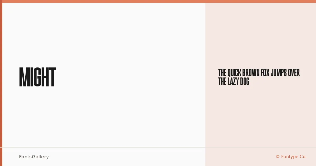
About Might Font
There is a deliberate heaviness to this sans serif — a stroke weight that leans into display work without apologizing for it. Funtype Co. released the family under their copyright, and what they have delivered is a single cut built around confident, modern geometry that commands attention at large sizes.
Design Aesthetics & Character Characteristics
Sitting squarely in the sans serif category, the design carries a bold, professional character that feels at home wherever impact matters most. The family ships as a single Regular style in TTF format, so its power comes entirely from the letterform construction itself — tight spacing, strong terminals, and a contemporary structure that reads as purposeful rather than decorative. Latin character coverage keeps it clean and focused.
Recommended Usage & Font Pairing
The weight and presence here make it a natural choice for headlines, posters, advertising campaigns, and logo lockups where the type needs to anchor the composition. For branding work, pairing it with the editorial softness of Canela or the hand-drawn character of Armelie creates productive contrast, while 321 Impact, AQUA, or Kactigona can push a layout toward something more aggressive and expressive.
License & Usage Terms
This family is released under a Demo license, which means it is available for personal use only — confirm licensing terms directly with Funtype Co. before committing it to any commercial project. The font is distributed with editable embedding permissions.