About Mayeka Font
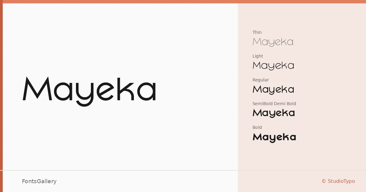
There is a quiet confidence to these letterforms — a controlled geometry that never tips into coldness. Designed by Mehmet Abaci for StudioTypo, the family moves through five weights: Thin, Light, Regular, Demi Bold, and Bold, all delivered as OTF files. The strokes are clean and even-tempered, with proportions that hold their composure whether set large or small.
Design Aesthetics & Character Characteristics
This is a sans serif built around elegance and restraint — minimal in detail, modern in proportion, and professional in finish. The Thin and Light cuts have an almost typographic lightness that suits editorial work, while the Demi Bold and Bold bring enough presence for display settings without shouting. Across the range, the spacing feels considered, lending a consistency of tone from weight to weight.
Recommended Usage & Font Pairing
The family sits naturally at the top of a layout: branding systems, magazine headlines, website headers, and logo lockups are where these weights earn their keep, particularly across Latin-language projects. For pairing, the family has been matched with Canela, Armelie, 321 Impact, ABC Arizona, and Kactigona — a varied roster that suggests it bridges editorial serif pairings as readily as display-focused companions.
License & Usage Terms
This is a Demo release covering a limited character set — it carries personal-use terms only, with embedding restricted, so confirm licensing at studiotypo.com before taking it into any commercial job.