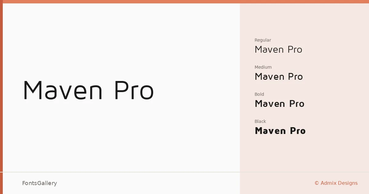
About Maven Pro Font
There is a particular kind of geometric sans that holds its own across contexts without ever raising its voice — clean terminals, confident proportions, and just enough personality to stay interesting at display sizes. Maven Pro, designed by Admix Designs, is that kind of face. Its letterforms carry a quiet precision: rounded details temper what might otherwise read as rigid, keeping the overall impression warm enough for editorial work while still feeling structured enough for corporate applications.
Design Aesthetics & Character Characteristics
The family spans four weights — Regular, Medium, Bold, and Black — delivered as TTF files, giving you a practical range from body-weight text to punchy headlines within a single, coherent system. The mood is minimal and modern, with a professional restraint that never tips into coldness. Moving from Regular to Black, the weight gain feels proportional rather than sudden; each step is usable in its own right, not just a fallback when the adjacent cut feels too light or too heavy.
Recommended Usage & Font Pairing
The face earns its keep in branding and logo work, where its geometric consistency reads clearly at small sizes and holds authority at large ones. It transitions naturally into magazine layouts and website headers, and its Latin character set covers the workload of most Western-language presentations and publications. For pairing, the measured geometry of this sans sits comfortably alongside the editorial warmth of Canela or the classical weight of Times New Roman; for something with more contrast in character, Angeletta and Armelie both offer display personality that plays well against its neutrality, and Minecraft brings an entirely different energy for projects that call for it.
License & Usage Terms
Maven Pro is released under the SIL Open Font License (OFL), which permits commercial use, and the embedding permission is set to installable, so you can confidently use it across both published documents and deployed applications.